





Chat List

Show All

  • A
  • avatar-1
  • avatar-2
  • avatar-3
  • avatar-4
  • B
  • avatar-5
  • avatar-1
  • avatar-2
  • D
  • avatar-3
  • avatar-4
  • J
  • avatar-5
  • avatar-1
  • avatar-2
  • avatar-3
  • O
  • avatar-4
  • avatar-5
Chat with Khelesh

Online

avatar-1
Hi, how are you samim? 8:40 AM, Today
Hi Khalid i am good tnx how about you? 8:55 AM, Today
avatar-2
avatar-1
I am good too, thank you for your chat template 9:00 AM, Today
You are welcome 9:05 AM, Today
avatar-2
avatar-1
I am looking for your next templates 9:07 AM, Today
Ok, thank you have a good day 9:10 AM, Today
avatar-2
avatar-1
Bye, see you 9:12 AM, Today
avatar-1
Hi, how are you samim? 8:40 AM, Today
Hi Khalid i am good tnx how about you? 8:55 AM, Today
avatar-2
avatar-1
I am good too, thank you for your chat template 9:00 AM, Today
You are welcome 9:05 AM, Today
avatar-2
avatar-1
I am looking for your next templates 9:07 AM, Today
Ok, thank you have a good day 9:10 AM, Today
avatar-2
avatar-1
Bye, see you 9:12 AM, Today
Notications

Show All

  • SEVER STATUS
  • KK
  • SOCIAL
  • RU
  • SEVER STATUS
  • AU
  • MO
Notes

Add New Nots

🔮 How Predictive CandleScope Works

The Model

A time-series foundation model trained on a large corpus of financial and general time-series data. It takes the last 512 hourly candles as context and outputs probabilistic price and volume paths for the next trading session.

Monte Carlo Sampling

Instead of a single prediction, the model runs 30 independent samples with stochastic decoding (temperature 1.2, top-p 0.95). This produces a distribution of possible futures rather than one deterministic line.

What You See on the Chart

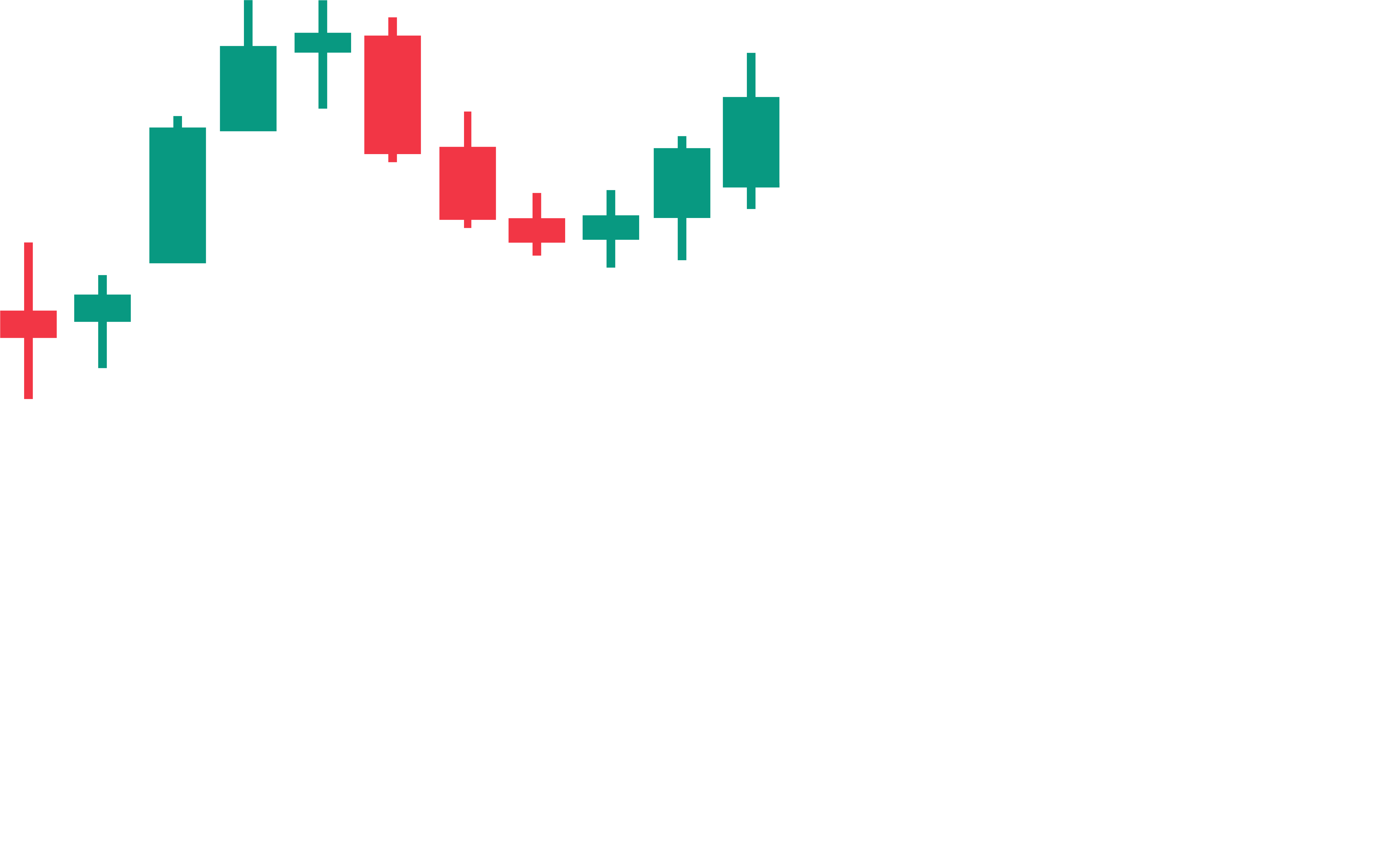
  • Candles Historical 1-hour close prices (last 12 days)
  • Orange line Mean forecast — average across all 30 sampled paths
  • Shaded band 10th–90th percentile range of all sampled paths
  • Red dashed Forecast boundary — where history ends and prediction begins
  • White line Live intraday price (market hours only)

Stat Cards Explained

  • Upside Probability — % of the 30 sampled paths whose final price is above the last known close. Values above 60% are bullish green, below 35% are bearish red.
  • Volatility Amplification — Ratio of predicted volatility to recent historical volatility, scaled to a 0–100% range. High values signal the model expects an unusually active session.
  • Aggregate Prediction — Average predicted price change (%) across all tracked tickers, giving a broad market sentiment signal.

Important Notes

  • Forecasts are updated once per day before market open and are not real-time predictions.
  • During market hours, live intraday prices are overlaid so you can compare the forecast against actual movement.
  • This tool is for informational purposes only and does not constitute financial advice.
🔮 Live SPY Forecast Dashboard
Last Updated: Interval: 1-Hour  |  Times in local timezone
⬆ Upside Probability
⚡ Volatility Amplification
🧠 Top Tickers Aggregate Prediction
Expected High (7h)
Expected Low (7h)
Demand-Based Move (24h)
IV Expected Move (24h)
24-Hour Probabilistic Forecast
Historical prices are shown as candlesticks. The orange line represents the mean trajectory across 30 Monte Carlo simulations generated by a foundation model pre-trained on more than 12 billion hourly candlestick records from all exchanges. This forecast projects the next 24 hours of market behavior. The red and green lines indicate the forecast boundaries, while the orange line shows the mean projected path. Read the science behind it (Download PDF)