Learn Center
Analyst Estimates
What analysts collectively expect a company to report for revenue, EPS, EBITDA, and EBIT, with the high and low forecasts and how many analysts sit behind each period.
What are analyst revenue estimates, and how do you read them on EZPZ?
An analyst revenue estimate is a forecast of the sales a company will report for a future period. The EZPZ Revenue Estimates page shows the range of those forecasts for one ticker: an Avg, a High and a Low for each year or quarter, plus how many analysts stand behind the period. It has three year pies, a trend chart, and a table with a Growth (%) column.
The range is the useful part. When Revenue High and Revenue Low sit close to Revenue Avg, analysts broadly agree on what the company will sell. When they spread apart, the forecasts disagree, or few analysts cover that period. Read the numbers in three passes. First compare Avg with the period before it, which is what Growth (%) does. Second measure High minus Low against Avg to see how wide the disagreement is. Third check the Analysts count, because a range built on 49 analysts says more than one built on a handful. A revenue estimate is a benchmark that the market judges the next report against. It is not a prediction from EZPZ and it does not say where the stock goes.
How the Revenue Estimates page works on EZPZ
The page opens on AAPL with the Annual view. The header card shows the word Investing, then the heading. It reads Revenue Estimates until the first result loads, then shows the ticker with its current price in a blue badge, such as AAPL $335.01. That price is the stock price, not a revenue figure. On the right there are two controls: a dropdown with Annual and Quarterly, and a symbol box with a Search button. Type a symbol and press Enter or click Search. The box uppercases what you type and does nothing when it is empty. Changing the dropdown loads the same ticker again in the new view.
The page loads when it opens, on each search, and on each Annual or Quarterly switch. It does not refresh on its own. A spinner shows while the request runs.
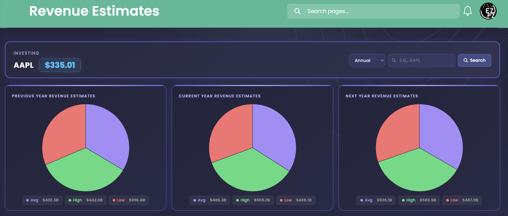
Below the header there are three blocks, top to bottom: the three year pies, the Revenue Estimates Trend chart, and the table. The pies summarize three years, the chart draws every period as a line, and the table lists each period with exact values.
How Analyst Estimates differs from the rest of investing
This page looks forward. Earnings Surprises looks back and shows how each reported quarter compared with what analysts expected, and Financial Statements shows the revenue a company actually reported. Price Target shows where analysts think the stock should trade, Recommendation Trends counts analysts by rating bucket, and Upgrade and Downgrade logs each firm's rating changes.
The rest of the investing set covers other questions. Basic Financials groups valuation, profitability and growth ratios. Ticker Performance shows how the price moved. Social Sentiment tracks the retail conversation. Company Profile, Company News, Market News, Sector Metrics, Historical Market Cap, Dividends, Support and Resistance and Congressional Trading fill in the rest. For the options side of one symbol, see Ticker Explorer.
The three year pies
Previous Year Revenue Estimates, Current Year Revenue Estimates and Next Year Revenue Estimates each show one year. Each pie has three slices and three chips underneath. The chips act as the legend, since the pie has no legend and no labels. Hover a slice to see its label and value.
| Chip and slice color | What you are looking at |
|---|---|
| Avg (purple) | The average analyst revenue estimate for that year. |
| High (green) | The highest analyst revenue estimate for that year. |
| Low (red) | The lowest analyst revenue estimate for that year. |
In the capture, the three pies read:
| Pie | Avg | High | Low | High minus Low |
|---|---|---|---|---|
| Previous Year | $423.3B | $442.6B | $396.4B | about $46.2B |
| Current Year | $486.3B | $505.7B | $438.1B | about $67.6B |
| Next Year | $536.1B | $583.5B | $487.9B | about $95.6B |
The Previous Year chips match the 2025 row of the table exactly (423.3B, 442.6B and 396.4B). The spread between High and Low grows the further out you look: about 11% of Avg for Previous Year, about 14% for Current Year and about 18% for Next Year. That is the usual pattern, since forecasts get harder the further from the report date. The Avg also rises, about 15% from Previous Year to Current Year and about 10% from Current Year to Next Year.
- Which years: Current Year is the present calendar year, Previous Year is the one before it and Next Year is the one after. Each pie adds up the rows whose Year column matches. On the Annual view that is one row per year. On the Quarterly view it is the four quarters of that year added together.
- No rows for a year: the chips read $0 and the pie draws three equal slices as a placeholder.
- Fiscal years: the Year column is the company's own year label. AAPL rows all end on 09-30, so its 2026 row is the year that ends 2026-09-30, not calendar 2026.
The Revenue Estimates Trend chart
The Revenue Estimates Trend, Avg / High / Low chart draws every period the page loaded, oldest on the left and newest on the right. In the capture the X axis runs from 2016-09-30 to 2033-09-30, 18 annual periods with one label each. It has three smoothed lines with a dot on each period and a legend at the top. The Y axis sits on the right side.

| Line | What you are looking at |
|---|---|
| Revenue Avg (purple, shaded below) | The average analyst revenue estimate for each period. |
| Revenue High (green) | The highest estimate for each period. |
| Revenue Low (red) | The lowest estimate for each period. |
Read it in three steps. First, find the slope of the purple line, which is the market's expected growth path. In the capture it climbs from about 220 billion dollars at 2016-09-30 to a little over 900 billion at 2033-09-30. Second, look at the gap between green and red. It is narrow on the left and wide on the right, so agreement fades with distance. Third, look for a period where one line pulls away from the others. At 2028-09-30 the green line jumps to about 670 billion against an average near 575 billion, wider than its neighbors. Check the Analysts column in the table for that period before you read anything into it. Those chart readings are approximate, so use the table for exact values.
- Hover: the tooltip lists all three values for the period under your cursor, even if you are not on a dot.
- Hide a line: click a legend entry to turn that line off and click it again to bring it back.
- The axis does not start at zero: in the capture the lowest tick is 200,000,000,000, so growth looks steeper than it would from a zero baseline. The tick labels print as full numbers with no dollar sign or unit.
- Smoothed lines: the curve bends between dots, so trust the dots and the table, not the shape between them.
- Small dips: the purple line dips at 2019-09-30 and 2023-09-30 in the capture. The table's Growth (%) column shows the same two periods in red.
Reading the estimates table
The table has nine columns and one row per period. It shows ten rows per page with paging under it, and has a Search box above the table on the right that filters every column. There is no page-length menu. It opens sorted by Period with the oldest first, so the 18 periods in the capture fill two pages and the newest, furthest-out rows are on page 2. Click the Period header to flip the order.

| Column | What you are looking at |
|---|---|
| Ticker | The symbol you searched, in blue. It repeats on every row. |
| Quarter | A dash on the Annual view. On the Quarterly view it carries the quarter. |
| Year | The company's own year label for the period. |
| Period | The date the period ends, printed as year, month, day. |
| Revenue Avg | The average analyst revenue estimate, in compact dollars such as $423.3B. Always green. |
| Revenue High | The highest estimate, also always green. |
| Revenue Low | The lowest estimate, always red. Green and red here only mark High and Low, they are not good and bad signals. |
| Analysts | How many analysts sit behind that period. |
| Growth (%) | Revenue Avg against the row just above it, in percent. Green at zero or above and red below zero. The first row has nothing to compare with and shows a red dash. |
In the capture, Revenue Avg for 2025-09-30 is $423.3B against a High of $442.6B and a Low of $396.4B, with 49 analysts, and a Growth of 6.28%. The check works on the printed cells: 423.3 divided by 398.3 for 2024 is about 1.063. The biggest jump on the page is 2021-09-30 at 34.05%, from $278.7B to $373.6B. Two rows are negative: 2019-09-30 at -1.89% and 2023-09-30 at -2.58%. The Analysts column ranges from 37 (2020) to 49 (2025) on this page, so no period here rests on a thin panel.
What are EBITDA estimates, and how do you read them on EZPZ?
EBITDA is earnings before interest, taxes, depreciation and amortization, a rough measure of the profit a business makes from operating before financing and accounting charges. An EBITDA estimate is what analysts expect that number to be for a future period. The EZPZ EBITDA Estimates page shows an EBITDA Avg, an EBITDA High and an EBITDA Low for each year or quarter, plus how many analysts stand behind the period. It uses the same header, pies, trend chart and table as Revenue Estimates, with the same Annual and Quarterly dropdown, so everything above about ranges, the Analysts count and Growth (%) applies here too.
EBITDA sits between revenue and net income. Revenue says how much a company sells. EBITDA says how much of that is left after the costs of running the business, before interest, taxes and the write-down of assets. Read it against revenue for the same period and you can see whether analysts expect profit to grow faster or slower than sales. EBITDA is not a standard accounting line, so treat it as a comparison figure and not as cash in the bank.

The header reads EBITDA Estimates until the first result loads, then shows the ticker and its current stock price in a blue badge, here AAPL $334.99. The three pies are Previous Year, Current Year and Next Year EBITDA Estimates. As on the revenue page, the chips under each pie carry the values and the slice sizes do not matter, since Avg, High and Low are always close to each other.
| Pie | Avg | High | Low | High minus Low |
|---|---|---|---|---|
| Previous Year | $146.7B | $155.9B | $135.2B | about $20.7B |
| Current Year | $173.7B | $181.1B | $164.7B | about $16.4B |
| Next Year | $182.4B | $203.2B | $153.5B | about $49.7B |
The Previous Year chips match the 2025-09-30 row of the table exactly. The spread does not simply widen with distance here. It is about 14% of Avg for Previous Year, about 9% for Current Year and about 27% for Next Year, so analysts agree most on the year in progress and disagree most on the year after it. The Avg rises about 18% from Previous Year to Current Year and only about 5% from Current Year to Next Year. Notice that the Next Year Low of $153.5B is below the Current Year Low of $164.7B, which is why the Next Year range is so wide. For comparison, the revenue capture for the same ticker had a Next Year spread of about 18% of Avg, so EBITDA forecasts disagree more than sales forecasts do.
The EBITDA Estimates Trend chart
The EBITDA Estimates Trend, Avg / High / Low chart draws every period the page loaded, oldest on the left. In the capture the X axis runs from 2016-09-30 to 2031-09-30, 16 annual periods, three smoothed lines with a dot on each period, and a legend at the top with EBITDA Average (purple, shaded below), EBITDA High (green) and EBITDA Low (red). The Y axis sits on the right and runs from 50,000,000,000 to 350,000,000,000 in the capture.

Read it in three steps. First, follow the purple line, the expected path. It climbs from about 72 billion dollars at 2016-09-30 to about 236 billion at 2030-09-30, then eases to about 232 billion at 2031-09-30. Second, look at the gap between green and red. In 2028-09-30 the green line jumps to about 323 billion against an average near 208 billion and a low near 177 billion, far wider than the periods on either side. Check the Analysts column on page 2 of the table for that period before you read anything into it. Third, look at the far right. At 2031-09-30 the three lines sit close together, about 223 to 239 billion. A tight range that far out can mean few analysts, not strong agreement, so check the Analysts count before you trust it. Those chart readings are approximate, so use the table for exact values.
- Hover: the tooltip lists all three values for the period under your cursor, even if you are not on a dot. Click a legend entry to hide a line and click again to bring it back.
- The axis does not start at zero: the lowest tick in the capture is 50,000,000,000, so the climb looks steeper than it would from a zero baseline. Tick labels print as full numbers with no dollar sign or unit.
- The Low line dips at 2027-09-30: it falls to about 153 billion after about 165 billion the period before. That is the same $153.5B Low that shows in the Next Year pie.
The EBITDA Estimates table
The table has nine columns and one row per period, ten rows per page, with a Search box above it on the right that filters every column. It opens sorted by Period with the oldest first, so the 16 periods in the capture fill two pages and the six newest, furthest-out rows are on page 2.

| Column | What you are looking at |
|---|---|
| Ticker, Quarter, Year, Period | The symbol, a dash on the Annual view (the quarter on the Quarterly view), the company's own year label, and the date the period ends. |
| EBITDA Avg | The average analyst EBITDA estimate in compact dollars such as $146.7B, in blue. |
| EBITDA High and EBITDA Low | The top and bottom of the range, in green and red. Those colors only mark High and Low. They are not good and bad signals. |
| Analysts | How many analysts sit behind that period. |
| Growth (%) | EBITDA Avg against the row just above it, in percent, green at zero or above and red below. The first row has nothing to compare with and shows a red dash. |
In the capture, 2025-09-30 reads EBITDA Avg $146.7B, High $155.9B and Low $135.2B with 34 analysts and Growth of 6.99%. The biggest jump on the page is 2021-09-30 at 54.21%, from $79.4B to $122.4B, far larger than any other year. Two rows are negative: 2019-09-30 at -6.95% and 2023-09-30 at -3.99%, the same two dips you can see on the purple line. Analysts runs from 18 (2017) to 34 (2025), so coverage of this metric grows over time and is thinner than the 49 analysts on the 2025 revenue row. Growth (%) uses the unrounded values, so dividing the printed cells can differ by a few hundredths of a percent, for example 2017 prints 0.32%.
The EPS, EBITDA and EBIT pages use the same layout
EZPZ has four estimate pages: Revenue Estimates, EPS Estimates, EBITDA Estimates and EBIT Estimates. They share the same header card, the same three year pies, the same Avg, High and Low trend chart, and the same table with Growth (%). Only the metric changes. Revenue, EBITDA and EBIT print in compact dollars such as $423.3B. EPS prints in dollars per share with two decimals, and its analyst column is headed Number of Analysts. EPS is what a share earns, EBITDA is operating profit before interest, taxes, depreciation and amortization, and EBIT is operating profit before interest and taxes. Everything above about ranges, the Analysts count, the pies and Growth (%) reads the same way on each page. The next three sections show the EBIT page with real values.
How do you read EBIT Estimates on EZPZ?
EBIT is operating profit before interest and taxes. The EZPZ EBIT Estimates page shows what analysts expect that figure to be for one ticker: an EBIT Avg, an EBIT High and an EBIT Low for each year or quarter, plus an Analysts count. The header, controls, pies, trend chart and table match Revenue Estimates. Only the metric changes, so a wide gap between EBIT High and EBIT Low means analysts disagree about profit, not sales.

Type a symbol and press Enter or click Search, or switch the dropdown between Annual and Quarterly. The heading reads EBIT Estimates until a result loads, then shows the ticker with its current price. The page loads on open, on each search and on each dropdown change, and does not refresh on its own.
| Pie | EBIT Avg | EBIT High | EBIT Low | High minus Low |
|---|---|---|---|---|
| Previous Year | $134.7B | $140.3B | $125.4B | about $14.9B |
| Next Year | $168.3B | $189.4B | $139.3B | about $50.1B |
The Previous Year chips match the 2025-09-30 row of the table exactly. The spread between High and Low is about 11% of Avg for Previous Year and about 30% for Next Year, far wider than the revenue spread on the same ticker. Profit forecasts diverge more than sales forecasts because they depend on costs as well as sales. The average also climbs about 25% from Previous Year to Next Year. On the Annual view each pie reads one table row, so check a chip set against the matching row of the table when a number looks off, and trust the table.
The EBIT Estimates Trend chart
The EBIT Estimates Trend chart draws every annual period the page loaded, oldest on the left. In the capture the X axis runs from 2016-09-30 to 2031-09-30, 16 periods with one label each. It has three smoothed lines with a dot on each period: EBIT Average in purple with shading below it, EBIT High in green and EBIT Low in red. The Y axis is on the right and prints full numbers such as 100,000,000,000 with no dollar sign.

Read the purple line first. In the capture it climbs from about 60 billion dollars at 2016-09-30 to about 215 billion at 2031-09-30, with small dips at 2019-09-30 and 2023-09-30 that the table's Growth (%) column also shows in red. Then look for lines that pull away. At 2028-09-30 the green line jumps to about 280 billion against an average near 190 billion, then falls back by 2029-09-30. The red line also dips at 2027-09-30, to about 138 billion, while the average keeps rising. A one period spike like that usually means a few analysts hold a much higher or lower view for that year, so check the Analysts count in the table before reading it as a trend. Chart readings are approximate, so take exact values from the table.
- Hover: the tooltip lists all three values for the period under your cursor.
- Hide a line: click a legend entry to turn it off and click again to bring it back.
- The axis does not start at zero: the lowest tick in the capture is 50,000,000,000, so growth looks steeper than it would from a zero baseline.
Reading the EBIT estimates table
The table has the same nine columns as Revenue Estimates, with EBIT Avg, EBIT High and EBIT Low in place of the revenue columns. It shows ten rows per page and a Search box above it on the right that filters every column. It opens sorted by Period with the oldest first, so the 16 periods in the capture fill two pages and the newest, furthest-out rows are on page 2.

| Column | What you are looking at |
|---|---|
| Ticker, Quarter, Year, Period | The symbol, a dash on the Annual view (the quarter on Quarterly), the company's own year label and the date the period ends. |
| EBIT Avg | The average analyst EBIT estimate in compact dollars such as $134.7B. Blue here, where Revenue Avg is green. |
| EBIT High and EBIT Low | The top and bottom of the range. High is green and Low is red, which only marks which end of the range they are. |
| Analysts | How many analysts sit behind that period. |
| Growth (%) | EBIT Avg against the row just above it. Green at zero or above and red below zero. The first row has nothing to compare with and shows a dash. |
In the capture, EBIT Avg for 2025-09-30 is $134.7B against a High of $140.3B and a Low of $125.4B, with 46 analysts and a Growth of 7.65%. The biggest jump on the page is 2021-09-30 at 64.84%, from $67.4B to $111.1B. Two rows are negative: 2019-09-30 at -9.87% and 2023-09-30 at -4.47%. Analysts range from 35 (2020) to 46 (2016 and 2025) on this page. Profit swings the percent more than sales do because EBIT is a smaller number than revenue, so a modest dollar change can print a large Growth (%).
Working the page
- Search a ticker: type a symbol, then press Enter or click Search. The heading changes to the ticker and its price.
- Switch to Quarterly: use the dropdown. The pies, chart and table all reload for the same ticker. If the symbol box is empty the page reloads AAPL.
- Find the newest rows: the table opens oldest first, so click the Period header or go to the last page.
- Empty results: a ticker with no estimates shows an empty table and chart, and the chips read $0. The page shows no message, so check the symbol.
- No refresh: search again or switch the dropdown to pull the latest.
How people actually use it
Size the disagreement
Subtract Revenue Low from Revenue High and compare it with Revenue Avg. AAPL in the capture goes from about 11% for the previous year to about 18% for next year.
Check the expected growth path
Read Growth (%) down the column to see where analysts expect sales to speed up or slow down, then confirm with the trend chart.
Judge how much to trust a row
Look at the Analysts column. A wide range on a period with a handful of analysts is weaker evidence than the same range with dozens.
Set up for earnings
Note the next quarter's Avg on the Quarterly view before a report, then compare it with the print on Earnings Surprises and the rating moves on Upgrade and Downgrade.