Learn Center
Dividends
Every dividend a company has paid or declared, with declaration, record and pay dates, amount and split adjusted amount, for one ticker.
What is a dividend history, and how do you read it on EZPZ?
A dividend history is the list of cash payments a company has made to shareholders, one row per payment, with the dates that matter for each one. The EZPZ Dividends page shows it for one ticker: a chart of Dividend Amount and Adjusted Amount by Pay Date, and a table with the Declaration Date, Record Date, Pay Date, amounts, Currency and Frequency of every payment.
Three dates describe every payment. The declaration date is when the company announces the dividend. The record date is the cutoff that decides who is owed it. The pay date is when the cash actually arrives. Two amounts describe the size. Amount is the per-share figure for that payment. Adjusted Amount restates it on a per-share basis that stays comparable after stock splits. Read the history in two passes. Use the Adjusted Amount line to see whether the real payout grew, held or was cut, and use the dates to see when a payment is coming. A raw Amount that steps down while the adjusted line stays flat is the pattern a split leaves, not a cut. A dividend history shows what a company has paid. It does not promise the next payment, which the board can change at any time.
How the Dividends page works on EZPZ
The page opens on AAPL. The header card shows the word Investing above the heading. The heading reads Dividends until the first result loads, then shows the ticker with its current price in a blue badge, such as NVDA $224.79. On the right, type a symbol and press Enter or click Search. The box does nothing when it is empty. A spinner shows while the request runs. The page loads once on open and once per search. It does not refresh on its own.
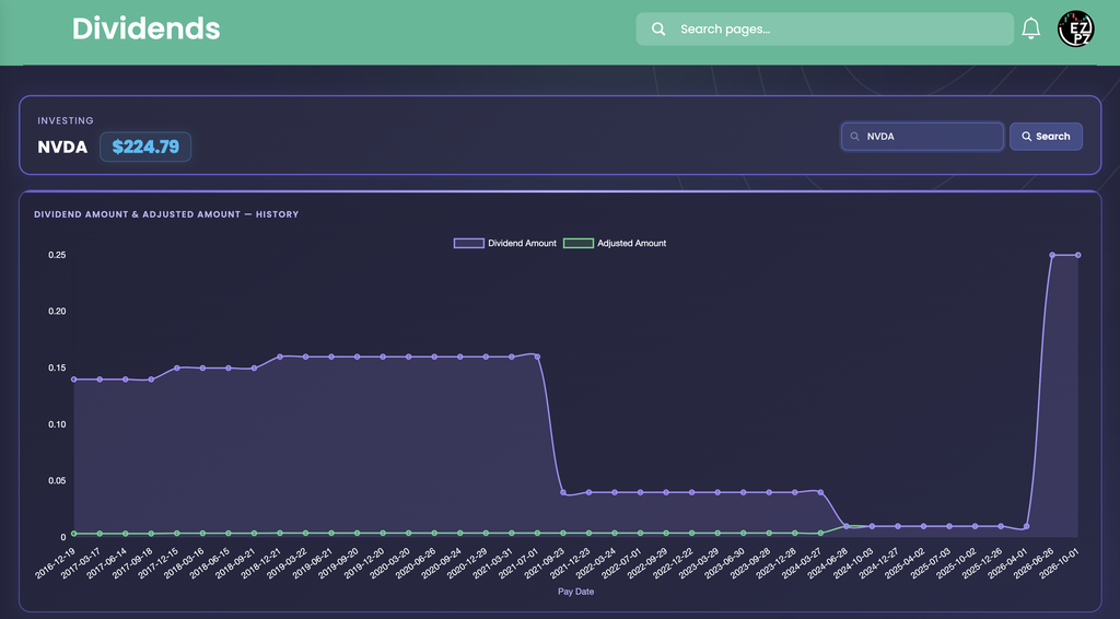
Below the header there are two blocks, top to bottom: the history chart and the payment table. The chart shows the shape of the whole record at a glance, and the table lists every payment with exact values and dates.
How Dividends differs from the rest of investing
This page is the payout record. It answers what a company has paid, how much, and on which dates. Basic Financials shows a single current snapshot of Dividend per Share, Dividend Yield and Payout Ratio, and this page is the history behind those numbers. Earnings Surprises and Analyst Estimates cover the profits that pay a dividend, and Financial Statements shows the cash and debt behind it.
The rest of the investing set covers other questions. Ticker Performance shows what the price did, and Historical Market Cap shows how the total value of the company moved. Company Profile says what the business is. Price Target, Recommendation Trends and Upgrade and Downgrade show what analysts think. Company News and Market News list the headlines, which is where a dividend raise or cut is usually reported. Social Sentiment, Support and Resistance, Sector Metrics and Congressional Trading round out the set. For a single-symbol view of the options side, see Ticker Explorer.
The Dividend Amount and Adjusted Amount chart
The chart is titled Dividend Amount & Adjusted Amount, History. It plots one dot per payment, oldest on the left and newest on the right, with the Pay Date along the bottom. The legend at the top names the two lines. The Y axis is plain numbers with no dollar sign, in the payment's currency per share.
| Line | What you are looking at |
|---|---|
| Dividend Amount (purple, shaded below) | The Amount column: the per-share payment as it was at the time. The line is smoothed between dots. |
| Adjusted Amount (green) | The Adjusted Amount column: the same payment restated for later stock splits, so old and new payments compare on one per-share basis. |
The NVDA capture shows why both lines exist. The purple line sits near 0.14 in December 2016, edges up to about 0.16 by late 2018, and stays flat until mid 2021. It then falls to about 0.04 and later to about 0.01 by 2024-06-28. Over the same stretch the green line stays close to zero, and the two lines meet at 0.01 from 2024-06-28 on. The page does not label the cause. A raw amount that steps down twice while the adjusted amount stays flat is what stock splits look like, and the adjusted line is the fair one for judging the size of the payout. At the right edge both lines jump to 0.25 for the last two payments, 25 times the earlier 0.01. That is a real increase, because the adjusted line rises with it.
- Hover: the tooltip lists both values for the payment under your cursor, even if you are not on a dot.
- Hide a line: click a legend entry to turn that line off and click it again to bring it back.
- Even spacing: the X axis lists payments, not calendar time, so a long gap between two payments draws the same width as a short one. Read the Pay Date labels for timing.
- Approximate readings: chart values are read by eye. Quote exact numbers only from the table.
Reading the payment table
The table has eight columns and one row per payment. It shows ten rows per page with paging under it, and opens sorted by Pay Date with the newest first. A Search box at the top right filters every column, so typing a year such as 2025 narrows the list to that year. Click a header to sort by that column. There is no page-length menu.

| Column | What you are looking at |
|---|---|
| Ticker | The symbol you searched, in blue. It is the same on every row. |
| Declaration Date | The day the company announced the dividend. |
| Record Date | The cutoff date that decides which holders are owed the payment. |
| Pay Date | The day the cash is paid. The chart's X axis and the default sort both use it. |
| Amount | The per-share payment, in green, rounded to two decimals. |
| Adjusted Amount | The same payment restated for later splits, in green, rounded to two decimals. |
| Currency | The payment currency, in blue. It reads USD when the data does not name one. |
| Frequency | A frequency value printed as the data sends it, in blue. The page does not explain it. |
In the capture, the top row is declared on 2026-08-26, has a Record Date of 2026-09-10 and pays on 2026-10-01, for 0.25 in both Amount and Adjusted Amount. Its Pay Date is later than the day of the capture, so it is an upcoming payment. The row under it follows the same rhythm: declared 2026-05-20, record 2026-06-04, paid 2026-06-26, also 0.25. Across the ten visible rows the record date comes about two weeks after the declaration and the payment about three weeks after the record date. Pay dates fall about a quarter apart. The size changed between the payment of 2026-04-01 (0.01) and the one declared on 2026-05-20 (0.25).
- Small payments print as 0.00: Amount and Adjusted Amount round to two decimals. A payment under half a cent reads 0.00 in the table, while the chart still plots the real value. For old payments of a company that has split, use the chart for the adjusted size.
- Frequency is not the cadence: the column reads 2 on every row in the capture, yet the pay dates are about a quarter apart. Work out how often a company pays by subtracting one Pay Date from the next.
- Dashes: a date the data does not include prints as a dash.
Working the page
- Search a ticker: type a symbol, then press Enter or click Search. The heading changes to the ticker and its price.
- Check the Ticker column: after a search, make sure the table's Ticker column matches the heading before you read the rows.
- No dividend history: many companies pay nothing, so a symbol with no payments has nothing to plot or list.
- No price badge: if the symbol has no current price, the badge hides but the payment rows still load.
- No refresh: the page loads once and after each search. Search again to pull the latest.
How people actually use it
Check the payout record
Follow the green Adjusted Amount line. A rising line is a company that has raised its payout. A flat run is one that has held it. A drop is worth a look at the news.
Separate a split from a cut
When the purple line falls, check the green line. If green stays flat, the amount was restated for a split and the real payout did not change.
Find the next payment
Sort by Pay Date and read the top row. If its Pay Date is still ahead, the Record Date beside it tells you the cutoff that matters.
Set a payout against the business
Compare the payment history with Earnings Surprises and Basic Financials to see whether a payout has room to grow or is stretching what the company earns.