Learn Center
Top-50 Aggregate Technicals
One technical indicator at a time for the fifty largest stocks by market cap, plotted as a scatter, plus market cap trend and SPY arbitrage charts.
How do you read technical indicators across the 50 largest stocks at once?
Top-50 Aggregate Technicals shows one technical indicator at a time for the fifty largest stocks by market cap. Each stock is a dot on a scatter chart. Height is the indicator reading, horizontal position and dot size are market cap, and color is the signal. Two cards above the chart count how many stocks lean bullish or bearish.
Use it to see breadth before you look at any single name. Pick a tab such as RSI or MACD, read the two cards, then scan the chart for clusters and outliers. A crowd of green dots on one side means the group is leaning one way. Dots far from the pack are stretched. Because the X axis is market cap, you can also see whether the mega-caps that move an index agree with the smaller names. The table underneath lists every stock with the reading on six timeframes, 1m, 5m, 15m, 1H, 4H, and 1D, so you can check whether a short-term signal holds on a longer one. Three tabs, Market Cap Trend, MCT Historical, and Arbitrage, are line charts for the group as a whole. The methodology behind each signal is not published, and the colors describe price that has already traded. They are not a forecast.
How the Top-50 Aggregate Technicals page works on EZPZ
The page opens on VWAP. A row of eleven tab buttons runs across the top: VWAP, RSI, MACD, ADX, SMA20, EMA50, EMA100, EMA200, Market Cap Trend, MCT Historical, and Arbitrage. The first eight are indicator tabs and share one layout. The last three are charts.
- Timeframe dropdown: 1m, 5m, 15m, 1H, 4H, or 1D. It sits at the right of the tab row and picks the timeframe the cards, the chart, and the Signal column read. It is not shown on the three chart tabs.
- Info button: the round i button opens the Trading Indicators Guide, a short legend for dot size, dot color, each indicator, and each timeframe.
- Ask AiPe: the AiPe assistant sits in the corner and reads the tab and timeframe you are on.
Every indicator tab has the same four parts, in the same order.
- Left card: the average reading across the stocks, with a colored bar and a count and share for each bucket.
- Right card, Market Sentiment: the bullish versus bearish split for the active indicator.
- Scatter chart: one dot per stock. Green is bullish or oversold, red is bearish or overbought, and grey is neutral. A white line with dots traces the historical average trend across the market cap range.
- Table: every stock with its Name and Market Cap, the reading on each timeframe, and a Signal badge for the timeframe you picked.
Timeframes map to trading styles in the guide: 1m for scalping, 5m and 15m for short-term trading, 1H and 4H for swing trading, and 1D for the longer trend. Pick one tab below to see what each screen shows and a worked example.
What does each tab on Top-50 Aggregate Technicals show?
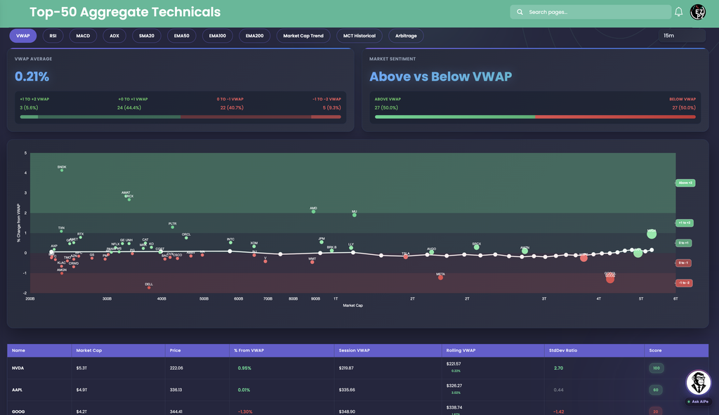
VWAP is the volume-weighted average price. This tab shows how far each stock's price sits from it. Above VWAP is the side buyers are winning, below is the side sellers are winning.
| Piece | What you see |
|---|---|
| VWAP Average | The average % Change from VWAP across the stocks, with four buckets and their counts: +1 to +2 VWAP, +0 to +1 VWAP, 0 to -1 VWAP, and -1 to -2 VWAP. |
| Market Sentiment | Above vs Below VWAP, as a count and a share for each side. |
| Chart | The Y axis is % Change from VWAP and the X axis is Market Cap. Bands on the right are labeled Above +2, +1 to +2, 0 to +1, 0 to -1, and -1 to -2. |
| Column | What you are looking at |
|---|---|
| Name | The ticker. |
| Market Cap | The company's market value, such as $5.3T. |
| Price | The latest price. |
| % From VWAP | How far price is from VWAP. Positive is above, negative is below. |
| Session VWAP | Today's VWAP price level. |
| Rolling VWAP | A steadier VWAP that spans more than one session. The small figure under it is price's gap to that level. |
| StdDev Ratio | Distance from VWAP measured in standard deviations. Readings well past +2 or -2 mean the stock is stretched away from VWAP. |
| Score | A 0 to 100 badge, green when it leans bullish and red when it leans bearish. How it is built is not published. |
In this capture: the VWAP Average is 0.21%. The buckets read 3 (5.6%) for +1 to +2 VWAP, 24 (44.4%) for +0 to +1, 22 (40.7%) for 0 to -1, and 5 (9.3%) for -1 to -2. Market Sentiment is an even 27 (50.0%) above and 27 (50.0%) below. SNDK sits highest on the chart near +4%, and DELL lowest near -1.7%.
The table shows why the StdDev Ratio matters. NVDA is only 0.95% above VWAP, yet its StdDev Ratio is 2.70 and its Score is 100, so it is stretched. AAPL is 0.01% above with a StdDev Ratio of 0.44 and a Score of 60, sitting almost on VWAP. GOOG is 1.30% below with a StdDev Ratio of -1.42 and a Score of 20.

RSI is a 0 to 100 momentum reading. The page's Trading Indicators Guide sets the frame: below 30 is oversold, 30 to 70 is the normal range, and above 70 is overbought.
| Piece | What you see |
|---|---|
| RSI Average | The mean RSI across the stocks, with five buckets: Oversold, Weak, Neutral, Strong, and Overbought, each with a count and a share. |
| Market Sentiment | Bullish vs Bearish. The info tooltip defines Bullish as 50 or higher and Bearish as below 50. |
| Chart | The Y axis is RSI Value. Bands on the right are labeled Overbought, Strong, Neutral, Weak, and Oversold. Oversold dots are green and Overbought dots are red. |
| Table | RSI (1m) through RSI (1d), then a Signal badge. The Signal column follows the timeframe dropdown, so it reads the same timeframe as the chart and the two cards. The other columns always show all six timeframes. |
In this capture: the RSI Average is 52.96. Oversold is 2 (3.4%), Weak 9 (15.5%), Neutral 31 (53.4%), Strong 8 (13.8%), and Overbought 8 (13.8%). Bullish and Bearish are tied at 29 (50.0%) each. SNDK, AMAT, AMD, and MU sit near or above 80, while AMGN sits near 25.
NVDA shows why to check more than one timeframe. It reads 72.8 on 1m, 82.0 on 5m, and 76.0 on 15m, so the Signal is OVERBOUGHT, but it cools to 59.7 on 4h and 54.0 on 1d. AAPL is the reverse, at 37.1 on 1m but 63.2 on 4h and 63.5 on 1d, with a NEUTRAL Signal at 15m.

MACD tracks momentum around a zero line. Positive is bullish momentum and negative is bearish momentum. The page splits the chart into just two zones, Bullish above zero and Bearish below it.
| Piece | What you see |
|---|---|
| MACD Average | The mean MACD across the stocks, with two buckets: Bullish and Bearish, each with a count and a share. |
| Market Sentiment | Positive vs Negative, as a count and a share. |
| Chart | The Y axis is MACD Value, with a green Bullish zone above zero and a red Bearish zone below it. |
| Table | MACD (1m) through MACD (1d) to three decimals, then a Signal badge of BULLISH or BEARISH. The Signal column follows the timeframe dropdown, so it reads the same timeframe as the chart and the two cards. The other columns always show all six timeframes. |
In this capture: the MACD Average is 0.55, with 30 (51.7%) bullish and 28 (48.3%) bearish. The axis runs from about -5.98 (AMGN) to 25.24 (SNDK). SNDK stretches the scale so far that most dots bunch near zero, so read the sign and the neighbors, not the height. MU also stands clear of the group.
GOOGL shows how the Signal follows only the selected timeframe. Its 1m reading is -0.695 and its 1d reading is -0.362, but its 15m reading is 0.582, so the badge says BULLISH. NVDA reads 0.610 on 1m, 0.310 on 15m, and -0.312 on 4h, also BULLISH at 15m.

ADX measures trend strength, not direction. The guide sets the frame: below 25 is a weak or absent trend, 25 to 50 is a moderate trend, and above 50 is a strong trend. Direction comes from the Signal badge, which reads Uptrend or Downtrend.
| Piece | What you see |
|---|---|
| ADX Average | The mean ADX across the stocks, with three buckets: Strong Trend, Trend, and No Trend, each with a count and a share. |
| Market Sentiment | Trend vs No Trend, as a count and a share. |
| Chart | The Y axis is ADX Value with three bands: Strong Trend, Trend, and No Trend. Green dots are uptrends and red dots are downtrends. |
| Table | ADX (1m) through ADX (1d), then a Signal badge of UPTREND or DOWNTREND. The Signal column follows the timeframe dropdown, so it reads the same timeframe as the chart and the two cards. The other columns always show all six timeframes. |
In this capture: the ADX Average is 26.98. Strong Trend is 6 (10.3%), Trend is 19 (32.8%), and No Trend is 33 (56.9%), so 25 stocks (43.1%) are trending and 33 (56.9%) are not. SNDK and AMGN sit highest on the chart.
Read the number and the label together. NVDA carries an UPTREND badge at 15m, but its 15m ADX is only 15.5, so that uptrend is weak. AAPL is also UPTREND with a 15m ADX of 15.4. GOOGL reads DOWNTREND with a 15m ADX of 22.8. On 1m, NVDA reads 41.2, the strongest of its six timeframes.

SMA20 is the simple moving average over the last 20 periods. This tab shows how far price sits above or below it. Because the period is short, it is the quickest of the four moving-average tabs to flip.
| Piece | What you see |
|---|---|
| SMA20 Average | The average distance of price from the SMA20, with two buckets: Bullish (above) and Bearish (below), each with a count and a share. |
| Market Sentiment | Positive vs Negative, as a count and a share. |
| Chart | The Y axis is SMA20 Value as a percent, with a green Above SMA zone over zero and a red Below SMA zone under it. |
| Table | SMA20 (1m) through SMA20 (1d). Each cell shows the % distance and, in brackets, the price of the average itself. Then a Signal badge. The Signal column follows the timeframe dropdown, so it reads the same timeframe as the chart and the two cards. The other columns always show all six timeframes. |
In this capture: the SMA20 Average is 0.30, with 32 (55.2%) bullish and 26 (44.8%) bearish. The axis runs from about -1.63% to 3.23%. SNDK and AMD sit highest, and DELL sits lowest.
NVDA is above its SMA20 on every timeframe, from 0.77% ($220.36) on 1m to 2.68% ($216.27) on 4h, so its badge is BULLISH. GOOGL sits 0.25% below its 15m SMA20 ($350.26) and reads BEARISH, yet its 1H, 4H, and 1D cells are positive, at 0.57%, 1.55%, and 2.23%.

EMA50 is the exponential moving average over the last 50 periods. An exponential average weights recent prices more, so it reacts faster than a simple one of the same length. This tab shows how far price sits from it.
| Piece | What you see |
|---|---|
| EMA50 Average | The average distance of price from the EMA50, with two buckets: Bullish (above) and Bearish (below), each with a count and a share. |
| Market Sentiment | Positive vs Negative, as a count and a share. |
| Chart | The Y axis is EMA50 Value as a percent, with a green Above EMA zone over zero and a red Below EMA zone under it. |
| Table | EMA50 (1m) through EMA50 (1d). Each cell shows the % distance and, in brackets, the price of the average itself. Then a Signal badge. The Signal column follows the timeframe dropdown, so it reads the same timeframe as the chart and the two cards. The other columns always show all six timeframes. |
In this capture: the EMA50 Average is 0.22, with 32 (55.2%) bullish and 26 (44.8%) bearish. The axis runs from about -4.64% to 6.81%. SNDK sits highest, while AMGN and KLAC sit lowest.
NVDA is above its EMA50 on every timeframe, from 0.88% ($220.12) on 1m to 3.22% ($215.12) on 1d. GOOGL is below on 1m and 5m, at -0.38% and -0.33%, but reads 0.13% ($348.90) at 15m, so it is BULLISH by a thin margin.

EMA100 is the exponential moving average over the last 100 periods. It is a slower trend line than EMA50, so a stock that is still above it has held its trend for longer.
| Piece | What you see |
|---|---|
| EMA100 Average | The average distance of price from the EMA100, with two buckets: Bullish (above) and Bearish (below), each with a count and a share. |
| Market Sentiment | Positive vs Negative, as a count and a share. |
| Chart | The Y axis is EMA100 Value as a percent, with a green Above EMA zone over zero and a red Below EMA zone under it. |
| Table | EMA100 (1m) through EMA100 (1d). Each cell shows the % distance and, in brackets, the price of the average itself. Then a Signal badge. The Signal column follows the timeframe dropdown, so it reads the same timeframe as the chart and the two cards. The other columns always show all six timeframes. |
In this capture: the EMA100 Average is 0.25, with 28 (48.3%) bullish and 30 (51.7%) bearish. This is the one moving-average tab in these captures where Bearish leads. The axis runs from about -6.95% to 9.27%, with SNDK highest and AMGN lowest.
AAPL is 0.06% above on 1m ($335.94) but 9.42% above on 1d ($307.19). NVDA is 1.87% above at 15m ($217.98) and 5.84% above on 1d ($209.80). Both read BULLISH.

EMA200 is the exponential moving average over the last 200 periods, the long-term trend line of the four. Sitting above it usually means the bigger trend is intact.
| Piece | What you see |
|---|---|
| EMA200 Average | The average distance of price from the EMA200, with two buckets: Bullish (above) and Bearish (below), each with a count and a share. |
| Market Sentiment | Positive vs Negative, as a count and a share. |
| Chart | The Y axis is EMA200 Value as a percent, with a green Above EMA zone over zero and a red Below EMA zone under it. |
| Table | EMA200 (1m) through EMA200 (1d). Each cell shows the % distance and, in brackets, the price of the average itself. Then a Signal badge. The Signal column follows the timeframe dropdown, so it reads the same timeframe as the chart and the two cards. The other columns always show all six timeframes. |
In this capture: the EMA200 Average is 0.33, with 31 (53.4%) bullish and 27 (46.6%) bearish. The axis runs from about -8.50% to 10.26%, with SNDK and AMD highest and AMGN lowest.
The 1D column shows the big picture. NVDA is 10.27% above ($201.37), AAPL is 15.88% above ($290.07), and GOOGL is 6.50% above ($328.06). Each is much further above on 1D than on 1m, which is what a healthy uptrend looks like on this tab.

This tab is a chart, not a scatter. There are no cards, no table, and no timeframe dropdown. It plots the combined market cap of the fifty stocks through the session as one line, so you can see the group move as a whole.
| Piece | What you see |
|---|---|
| Weighted Market Cap | The white line. The Y axis on the right is labeled Weighted Market Cap and the X axis is Time. |
| Shaded band | Smoothed lines follow the white line. The fill between them is green where the white line is above the band and red where it is below. |
| Buy Signal | A green up triangle placed on the chart where the page marks a buy. |
| Sell Signal | A red down triangle placed on the chart where the page marks a sell. |
In this capture: the time axis runs from 7:00 pm to just after 1:00 am. The line opens near the top of the range, slides through the early hours to a low a little before 10:00 pm, then climbs and finishes near $48.8T. The whole chart spans only about $48.5T to $49T, roughly one percent, so it is zoomed in and small wiggles look large. The band flips between red and green several times, and the markers cluster at those flips.
Use it as context for the scatter tabs. If the RSI and MACD tabs lean bearish while the white line is under its band, the weakness is broad and it is the big names driving it.

MCT stands for Market Cap Trend. This tab draws the same chart as Market Cap Trend, but the X axis is Date instead of Time, so each point is a day and the view covers a much longer window.
The legend and markers are the same: the white Weighted Market Cap line, a shaded band that turns green above and red below, and Buy Signal and Sell Signal triangles. On a daily view the band is smoother and the markers are far fewer than intraday.
In this capture: the axis runs from 2026-06-22 to mid September and the value range is about $44.5T to $49T. The line dips to a low near $44.8T in late July, jumps to about $48.5T within days, and finishes at the right edge near $48.7T, its highest reading in the window. Only a handful of markers appear across the whole span.
Use it to judge whether today's move is a blip or part of a multi-week trend. A quiet day on Market Cap Trend can still be a new high here.

This tab compares the Top-50 group with SPY. Both lines are rebased to 100 at the start of the window, so you can compare how much each moved without worrying about different price levels. The third line is the gap between them.
| Piece | What you see |
|---|---|
| Intraday and 90D Historical | Two buttons above the chart. Intraday shows today's session. 90D Historical shows the last 90 days. |
| Top50 (rebased) | The blue line, on the left axis labeled Rebased to 100. |
| SPY (rebased) | The orange line, on the same left axis. |
| Spread (Top50 - SPY) | The green line, on the right axis labeled Spread. Above zero means the Top 50 is ahead of SPY. Below zero means SPY is ahead. |
In this capture: both lines start near 100. The Top50 line falls faster than SPY through the early hours and reaches about 99.2 around 9:12 pm, while SPY holds near 99.6. Both recover late, but SPY finishes near 100.05 and Top50 near 99.7. The green Spread stays below zero for most of the session, bottoming near -0.45 and ending near -0.35, so SPY led for most of the session.
Remember there are two vertical axes. The blue and orange lines read on the left, and the green Spread reads on the right. A widening negative Spread means the largest names are lagging the broader index. A widening positive Spread means the reverse.
How do you read the tabs together?
One tab is one view. The page is most useful when you move through several in a row, on the same timeframe.
- Read the two cards first. They give the group average and the bullish versus bearish split in a glance.
- Scan the chart for clusters and outliers. A tight green cluster is broad strength. A single dot far from the pack, such as SNDK in these captures, deserves a look on its own.
- Find the extremes in the table. The most stretched stocks are the ones to check on other timeframes.
- Compare timeframes. The same signal on 1m, 5m, and 15m is stronger than one that only shows on a single column.
- Weigh by market cap. When the largest dots all sit in one zone, that zone is what is driving the index.
The four moving-average tabs work well side by side, because each one is a longer trend line. On the 15m timeframe in these captures, the bullish share was:
| Tab | Bullish | Bearish |
|---|---|---|
| SMA20 | 32 (55.2%) | 26 (44.8%) |
| EMA50 | 32 (55.2%) | 26 (44.8%) |
| EMA100 | 28 (48.3%) | 30 (51.7%) |
| EMA200 | 31 (53.4%) | 27 (46.6%) |
The captures were taken within a few minutes of each other, so the differences are real but small. A group that is above the short averages and the long ones is in a cleaner trend than one that is split across them.
How Top-50 Aggregate Technicals differs from the rest of stocks-analytics
This page reads one indicator at a time across the largest stocks, and it does not roll them into one score. Technical Analysis does the opposite: it goes deep on a single symbol and gives Oscillators, Moving Averages, and Summary gauges. The three regime pages give each symbol a score and a regime label: Intraday Regime Leaderboard for the current session, Swing Regime Leaderboard for setups held days to weeks, and Investing Regime Leaderboard for the longer horizon. Market Price Action Trend compares the market with one ticker as two stacked trend charts with an EMA ribbon. Seasonal Returns shows how a ticker has historically performed in each calendar month. Predictive CandleScope is the forward-looking page, with a probabilistic 24-hour forecast and an Alpha Board that ranks tracked symbols. Volume Surge Trades is a flow page instead, with S&P 500 buy versus sell dollars by sector and stock. Top Money Flow ranks stocks by dollars traded today. Use this page when the question is how the biggest names look together and whether they are leading or lagging SPY. For the wider picture of a single name, Ticker Explorer is the one-symbol dashboard, and the Market Dashboard covers the broader market.
How people actually use it
Check breadth before a trade
Open RSI or MACD and read the Market Sentiment card. If the split is lopsided, the whole group is leaning one way, which is useful context for an index or mega-cap trade.
Find stretched names
Sort your eye down the table for the highest and lowest readings, then confirm on a longer timeframe before treating them as stretched.
Separate strength from direction
Use ADX to see whether a trend exists, then read the Uptrend or Downtrend label. A label next to a low ADX is a weak trend.
See if the leaders are lagging
Open Arbitrage and read the Spread. A widening negative Spread means the largest names are trailing SPY.