Learn Center
Market Price Action Trend
Two stacked trend charts that show the broad market and one ticker, each with a green or red EMA ribbon and EMA Cross labels.
How do you read the Market Price Action Trend chart?
Market Price Action Trend is a pair of stacked line charts that compare the broad market's trend with one ticker's trend. Each chart draws a white price line over a blue trend line, with a green or red ribbon between them. Green means the white line is above the blue line. Red means it is below.
Read the top chart first, because it is the market backdrop and it never changes with your search. Then read the bottom chart, which starts on SPY and follows whatever ticker you load. If both ribbons share a color, the ticker is moving with the tape. If they split, the ticker is showing relative strength or weakness of its own. The EMA Cross labels mark the moments the white line crossed the blue line, so you can see how recently a color flipped and whether it held. Colors describe price that has already printed, so they are context, not a forecast. Hover a point for the time and the EMA Short, EMA Long, and EMA Extra readings. The exact methodology behind the white line and the EMAs is not published, so use the colors, the crosses, and the alignment between the two charts.
How Market Price Action Trend works on EZPZ
The page opens on SPY. A header box shows the ticker and its last price, such as SPY $761.54, with a Search ticker field and a Go button on the right. Under it, a heading reads Market Price Action Trend vs SPY Price Action Trends, and the ticker name updates when you load a new symbol. Both charts sit in one card. The card has an EMA Cross Lines checkbox in the top right, checked by default.
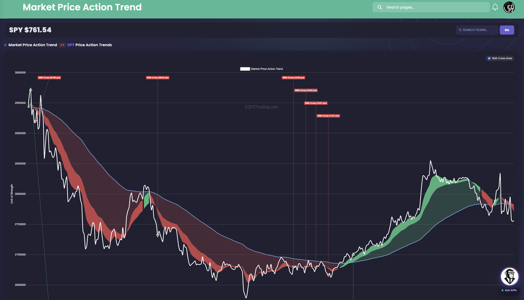
In this capture the market line falls from roughly 2,950,000 to below 2,650,000, spends most of that decline under a red ribbon, then rebounds into a green stretch. At the far right edge it has slipped back under the blue line and the ribbon is red again. The axis is titled Unit of Strength and the ticks are plain numbers, not dollars, and the market chart has no time axis of its own.
How this differs from other Stocks Analytics pages
This page is a trend picture, not a list. Technical Analysis turns one symbol's indicators into Buy, Neutral, and Sell gauges, and Top-50 Aggregate Technicals summarizes the largest names together. Intraday Regime Leaderboard, Swing Regime Leaderboard, and Investing Regime Leaderboard rank names by regime and score. Predictive CandleScope is a forward forecast, while this page only shows what price has already done. Volume Surge Trades and Top Money Flow are about dollars traded, and Seasonal Returns is about calendar patterns.
The same chart also appears as a card lower on other pages. Market Wave, Movers and Shakers Tide, Net Flow Graph, and 0DTE Graph put it under their options premium charts, and Market Dashboard puts it next to the index candles. Here it gets a full page and a market backdrop above it. For a one-symbol overview, open Ticker Explorer.
Anatomy of the charts
You do not need every element on every read. Use the tabs as a map.
| Element | What you are looking at |
|---|---|
| White line | The price line. The legend names it Market Price Action Trend on the top chart and SPY Price Action Trend (or your ticker) on the bottom chart. |
| Blue line | The EMA Extra line, the outer edge of the ribbon. The white line crossing it is what flips the color. |
| Green ribbon | The white line is above the blue line. The trend reads bullish. |
| Red ribbon | The white line is below the blue line. The trend reads bearish. |
Each ribbon has a brighter band and a darker band in the same color. They are shading of the trend, not two separate signals.
With EMA Cross Lines checked, a dashed vertical line and a label such as EMA Cross (07:07 pm) mark each cross, and a small triangle sits on the price line. Green marks an upward cross, red a downward one.
Only well-spaced crosses are drawn, so a quiet stretch does not fill with labels. Uncheck EMA Cross Lines to clear the labels from both charts when they crowd the price line.
| Chart | Axes |
|---|---|
| Market | Unit of Strength on the vertical axis, plain numbers, no time axis. |
| Ticker | Dollar ticks on the vertical axis (the title still reads Unit of Strength) and a Time axis underneath, in your browser's local time zone. |
Reading your ticker against the market
The bottom chart is the reason to load a symbol. Type a ticker in Search ticker, press Enter or click Go, and the heading, the header badge, and the bottom chart change. The top chart stays on the broad market.

In this capture
- The white line dips to about $758.15 near 09:54 pm, then climbs toward about $761.95.
- The ribbon is red through most of the early window and turns green after the green cross at 10:30 pm.
- At the right edge SPY sits above its blue line, while the market chart above it has just gone red. That split is the divergence case.
What to check
- Same color on both charts: the ticker is moving with the market.
- Opposite colors: the ticker is acting on its own, so look for news or a sector reason.
- How long ago the last cross printed, and whether price has held its side since.
Controls
- Ticker badge: The loaded symbol and its last price.
- Search ticker and Go: Load a symbol on the bottom chart. An empty search returns to SPY, and the address bar keeps the ticker so you can share the view.
- EMA Cross Lines: Checked by default. Turns the cross labels and dashed lines on or off for both charts.
- Hover: Shows the time and the EMA Short, EMA Long, and EMA Extra readings at that point.
- Live updates: While the market is open the charts refresh on their own.
How people actually use it
Check the backdrop first
Look at the top chart before any single name. A green market ribbon is a constructive backdrop, and a red one means the broad tape is under pressure.
Load the name you care about
Search a ticker and compare ribbon colors. Matching colors mean the stock is following the market. Opposite colors mean it is on its own.
Watch how recent the flip is
A cross that just printed has not been tested yet. A ribbon that has held its color across several labels tells a steadier story.
Pair it with the prints
When a ribbon flips, open Live Flow or Dark Pool Flow to see what traded around that time.