Learn Center
Seasonal Returns
A year by month heatmap of a ticker's percentage returns, with an Average row, a Yearly column, and a Summary grid of hit rates and extremes.
How do you read monthly seasonal returns for a stock?
Seasonal Returns is a year by month heatmap of one ticker's percentage return. Each row is a year, each column is a calendar month, and a Yearly column closes the row. Green cells are positive months, red cells are negative months, and a second Summary grid boils every month down to averages, hit rates, and extremes.
Start with the Average row, which shows the mean return for each calendar month across every year on the page. In this capture of SPY, Nov (3.09%), Jul (2.53%), and Oct (2.27%) lead, and Sep (-1.13%) is the only negative average month. Then test each month before you trust it. Check % Positive Month, compare the Average with the Month Median Return, and scroll the year rows to see whether the pattern still held in recent years. A month is more convincing when the average, the median, and the hit rate all agree. Seasonality describes what happened in past years, not what this year will do.
How Seasonal Returns works on EZPZ
The page opens on SPY. A header box shows the loaded ticker and its last price, such as SPY $766.57, with a Filter ticker field and a Go button on the right. Below it sit two cards: a heatmap headed SPY Total Percent Returns, and a grid headed Summary.
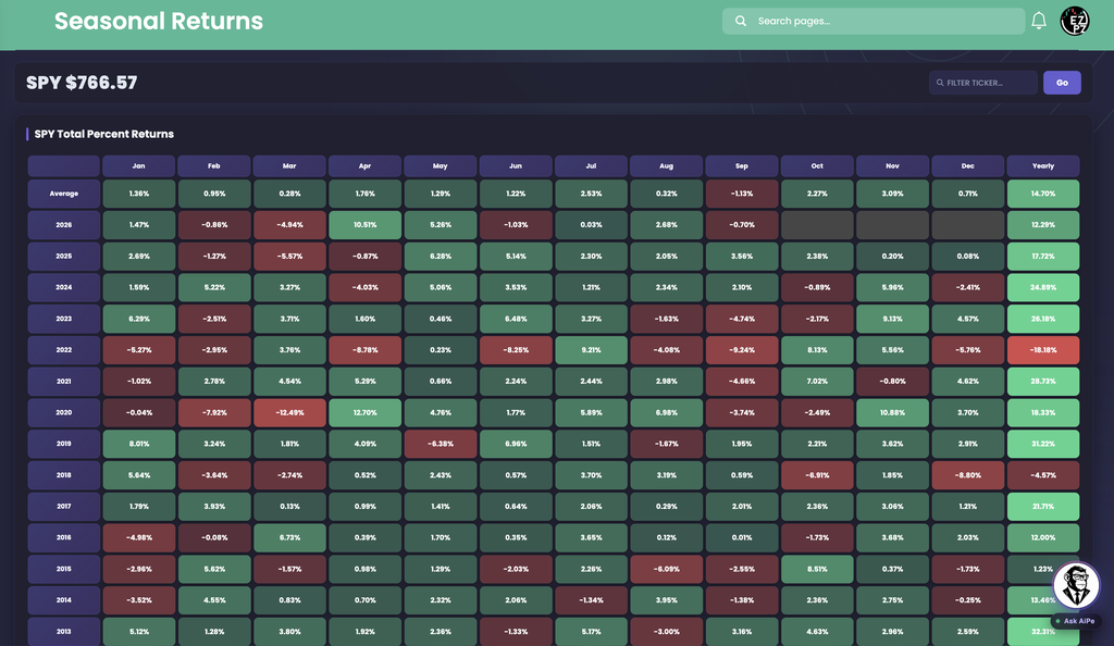
In this capture the 2026 row is still filling in. Jan through Sep have values, Oct, Nov, and Dec are grey, and the Yearly cell reads 12.29%. The September cell (-0.70%) comes from a month that was still in progress when the shot was taken, so it can change. The capture also cuts off at 2013, and the grid keeps going below that.
How this differs from other Stocks Analytics pages
This page looks backward across the calendar. It does not read today's tape. Technical Analysis turns one symbol's indicators into Buy, Neutral, and Sell gauges, and Top-50 Aggregate Technicals summarizes the largest names together. Market Price Action Trend compares the market with one ticker over the recent session, and Predictive CandleScope is a forward forecast. Intraday Regime Leaderboard, Swing Regime Leaderboard, and Investing Regime Leaderboard rank names by regime and score. Volume Surge Trades and Top Money Flow are about dollars traded right now.
For how much a name has actually moved, open Historical Volatility, and for a one-symbol overview use Ticker Explorer.
Anatomy of the two grids
Use the tabs as a map of what each row and column is.
| Element | What you are looking at |
|---|---|
| Year rows | One row per year, newest first. Each cell is that ticker's percentage return for that calendar month. |
| Average | The top row. The mean return for each month across every year on the page. |
| Yearly | The last column. The return for the whole year, such as 31.22% for 2019 and -18.18% for 2022 in this capture. |
| Green and red cells | Green is a positive return and red is negative. The shade deepens as the move gets larger. |
| Grey cells | No return for that month yet, such as Oct to Dec in the current year. |
Hover any cell to see its year, month, and value as a tooltip.
| Row | What it shows for each month |
|---|---|
| Average | The same mean return as the Average row in the heatmap above. |
| % Positive Month | The share of years that month closed green. |
| % Negative Month | The share of years that month closed red. |
| Month Median Return | The middle value when every year for that month is sorted. A "typical year" read. |
| Month Best Return | The single best return for that month in any year. |
| Month Worst Return | The single worst return for that month in any year. |
| Absolute Average Return | The average size of the move for that month, ignoring direction. Higher means a more volatile month. |
| Absolute Best Return | The largest move for that month, up or down. |
| Absolute Worst Return | The smallest move for that month, up or down. It is the quietest year, not the worst loss. |
The Summary grid has Jan to Dec columns only. It has no Yearly column.
Reading the Summary grid
The Summary card starts with a headline line that names the single best and worst month in the whole history, each with its month and year. It is the fastest way to see the range you are working with.

In this capture
- Jul has the highest hit rate at 87.50% positive, with a 2.53% average and a worst month of only -2.00%.
- Nov and May each close positive 81.25% of the time. Nov has a 3.09% average and a -0.80% worst.
- Sep is the weakest month. It is positive 50.00% of the time, its average is -1.13%, its median is -0.34%, and its worst is -9.24%.
- Apr shows why to check the median. Its Average is 1.76%, but its Month Median Return is 0.98%, because one strong Apr (12.70%) lifts the mean.
- Oct has the highest Absolute Average Return at 4.27%, so it has been the most volatile month in either direction.
What to check
- Do Average, Month Median Return, and % Positive Month point the same way?
- Is the Month Best or Month Worst a lone outlier that skews the average?
- Is the Absolute Average Return high enough that you should expect wider swings?
Cell colors in Summary are a quick visual only. Percentage rows such as % Positive Month and % Negative Month are large numbers, so their cells look strongly shaded almost everywhere. Compare the printed values, not the shade. In the % Negative Month row, a higher percentage is drawn in red.
Controls
- Ticker badge: The loaded symbol and its last price.
- Filter ticker and Go: Type a symbol and press Enter or click Go. Both grids and the headline reload for that ticker. An empty search returns to SPY.
- Hover: Shows the year, month, and value for a heatmap cell, or the month and metric for a Summary cell.
- Live updates: While the market is open the page refreshes on its own, so the month in progress can move.
How people actually use it
Find the strong and weak months
Scan the Average row for the months that stand out, then confirm them in Summary with % Positive Month before giving them any weight.
Separate a pattern from an outlier
When the Average is far above the Month Median Return, one or two big years are doing the work. Trust the median for a typical year.
Size for the month's swings
Absolute Average Return tells you how big the moves usually are, regardless of direction. Use it as context for position size and stop distance.
Check the recent years
Scroll the year rows to see whether a month's pattern still held lately or changed direction. Then compare with live prints on Live Flow.