Learn Center
Financial Statements
Revenue, profit, debt, cash and 22 ratio columns for one ticker, by year or by quarter, with four charts of the latest ten periods.
What are financial statements, and how do you read them on EZPZ?
Financial statements are the reports a company files to show what it earned and what it owns and owes. The income statement covers a stretch of time, such as revenue and net income. The balance sheet is a snapshot of assets, liabilities, equity, debt and cash. The EZPZ Financial Statements page puts both side by side for one ticker, by year or by quarter.
A single year tells you little. What matters is the direction: whether revenue keeps growing, whether profit grows with it, and whether debt and cash are moving the right way. A company can post record revenue while its margin shrinks, and it can look cheap on one ratio while its balance sheet gets weaker. So read down a column to see a trend, then across a row to check that the numbers agree with each other. Total Assets should equal Total Liabilities plus Total Equity, and a healthy trend in profit should show up in equity over time. These figures describe what a company has already reported. They do not tell you what the stock will do next, and they lag the price, so use them to understand the business behind a ticker and to question a story, not to time an entry.
How the Financial Statements page works on EZPZ
The page opens on AAPL in Annual view. The header card shows the word Investing above the heading, which adds the ticker after the title once data loads. On the right are three controls: a dropdown with Annual and Quarterly, a symbol box, and a Search button. Type a symbol and press Enter or click Search. The box uppercases what you type and does nothing when it is empty. Changing the dropdown reloads at once for the ticker in the box, or for AAPL if the box is empty. A spinner shows while the data loads.
The page loads on open, on each search and on each dropdown change. It does not refresh on its own, so search again to pull the latest filing.
Below the header the page has two blocks, top to bottom: a two by two grid of four bar charts, then a table with one row per period. The charts show the latest ten periods. The table lists every period the page loaded, ten rows per page.
How Financial Statements differs from the rest of investing
This page shows the business itself: what it earns, owns and owes, period by period. Basic Financials is a one page snapshot of valuation, profitability, growth and financial health, and Company Profile lists identifying facts such as exchange and industry. Earnings Surprises compares each quarter's reported EPS with what analysts expected, and Analyst Estimates shows the forward numbers. Historical Market Cap charts a company's total value across a date range you choose, and Dividends covers what a company pays out.
The rest of the investing set looks at the stock from other angles. Sector Metrics gives the sector Median for financial metrics, which is the yardstick for a ratio you find here. Ticker Performance shows what the price did, and Recommendation Trends, Upgrade and Downgrade and Price Target summarize what analysts think. Social Sentiment tracks the retail conversation, and Support and Resistance marks levels where price has stalled. Company News and Market News give the headlines behind a change, and Congressional Trading lists trades that lawmakers have disclosed. For the options side of a symbol, see Ticker Explorer.
The four charts
Each chart is a grouped bar chart with one cluster per period, oldest on the left, and a watermark across the top. Hover a cluster to see every value for that period, and click a legend entry to hide or show a series. Values print in short form, such as 100B for one hundred billion.
| Chart | Bars | What it answers |
|---|---|---|
| Revenue / Net Income / EBIT | Revenue (blue), Net Income (green, or red when negative), EBIT (gold) | Is the business growing, and does profit grow with revenue? |
| Cash vs Debt | Cash (green), Debt (red) | Can the company cover what it owes, and is the gap widening? |
| Operating & Free Cash Flow | Operating Cash Flow, Free Cash Flow, Net Income, Cash Flow For Dividends, Stock Based Compensation | How does cash generation compare with reported profit? See the caution below. |
| ROIC vs WACC (%) | ROIC % (green), WACC % (red) | Does the business earn more on its capital than that capital costs? |
Revenue, Net Income and EBIT
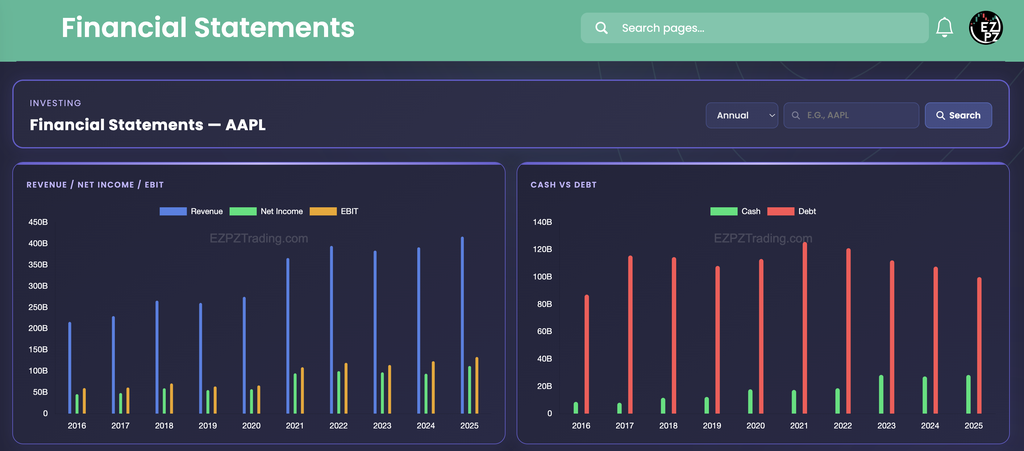
Watch the gap between the blue bar and the green and gold bars. If the blue bar grows but the others stay flat, growth is not reaching profit. In the capture, revenue rises from about $215B in 2016 to $416.2B in 2025. It dips in 2019 and 2023, which matches the two red Revenue Growth values in the table below (-2.04% and -2.80%). Net Income grows faster than revenue over the same stretch, from $45.7B to $112B. EBIT sits above Net Income in every year, at roughly $130B in 2025 (a chart reading, so approximate).
Cash vs Debt
Compare the height of the red bar with the green one. In the capture, debt is far larger than cash in every year. Debt peaks at $125.6B in 2021 and falls to $99.9B by 2025, while cash grows from $8.6B in 2016 to $28.3B. The Cash bar uses the table's Cash column only, so the separate Cash Equivalents column ($7.7B in 2025) is not added in.
Cash flow and ROIC charts, with a caution
The lower two charts are calculated by the page from the income statement and balance sheet figures. They are not read from the company's own cash flow statement, and the page does not include that statement. Treat both charts as rough guides to direction, and go to the company's filing when you need reported cash flow or return figures.

- Operating and Free Cash Flow: in the capture the Operating Cash Flow and Free Cash Flow bars are the same height in every year, so read them as one estimate, not two. They run negative from 2016 to 2020 while Net Income is positive in every year. That mismatch is a reason to check the company's cash flow statement before relying on the chart.
- Stock Based Compensation: this is an estimate, not the reported figure. In the capture it is a small pink bar in every year.
- Cash Flow For Dividends: the purple bar is not visible in the capture, so do not count on it showing for every ticker.
- ROIC % vs WACC %: ROIC sits far above WACC in every year of the capture, at about 111 in 2025 against a WACC near 8 or 9. WACC barely moves from year to year, because it is calculated with simplified assumptions. Read the chart for direction and for whether ROIC stays above WACC, not as a precise return, and do not compare it with an ROIC quoted elsewhere.
- What to trust most: the Net Income bars in these charts match the Net Income column in the table, which is a reported figure.
Reading the ratio table
The table has 22 columns and one row per period, with a search box above it that filters every column. It shows ten rows per page with paging under it, has no page-length menu, and opens sorted by the first column with the newest period first. Money values print in short form such as $416.2B, so sorting by a header may order by text instead of size. Rely on the default order. The wide table scrolls sideways, so the capture ends at Shares Outs.

| Column | What you are looking at |
|---|---|
| Year | The fiscal year in Annual view. It becomes Period, the date the quarter ended, in Quarterly view. |
| Revenue | Total sales for the period. |
| Revenue Growth | The change from the row before it, green up and red down. The oldest row reads 0.00% because there is nothing earlier to compare with. |
| Market Cap. | The company's total value, matched to the period. Annual uses the latest reading in that year, and Quarterly uses the reading nearest the period end. |
| PS | A price per share in dollars, not the price to sales ratio the abbreviation suggests. In the capture 2025 reads $271.92, which matches a $4T market cap spread over 14.8B shares. |
| P/B Ratio | Price per share against tangible book value per share, so companies with a small book can print very high values. |
| EPS | Net Income per diluted share for the period. |
| Net Profit Margin | Net Income as a percent of Revenue. |
| Net Income | Profit after all costs and taxes. |
| Total Assets, Total Liabi., Total Equity | What the company owns, owes and has left over. Assets equal Liabilities plus Equity. |
| Total Debt | Borrowed money, part of Total Liabilities. |
| Cash, Cash Equivalents | Cash on hand and short term holdings that convert to cash quickly, shown in separate columns. |
| Shares Outs. | Shares outstanding, in short form such as 14.8B. |
| D/E Ratio | Total Debt divided by Total Equity. |
| Current Ratio, Quick Ratio, Cash Ratio | Three tests of whether short term assets cover short term bills, from loosest to strictest. Quick Ratio needs an inventory figure, so it can read a dash for a company that reports none. |
| Net Debt, Tangible BVPS | Debt net of cash, and tangible book value per share. |
The capture shows the first fifteen columns. It does not show D/E Ratio through Cash Ratio, so scroll the table right on the live page to read them. A dash means the value is missing or zero for that period.
Some quick checks the capture supports. The balance sheet balances: 2025 shows Total Assets of $359.2B, which is Total Liabi. of $285.5B plus Total Equity of $73.7B. Revenue Growth reconciles too: $416.2B against $391B is 6.43%. Between 2016 and 2025, revenue rises by about 1.9 times and Net Income by about 2.4 times, while EPS rises from 2.08 to 7.46, about 3.6 times. The gap is the share count: Shares Outs. falls from 21.3B to 14.8B, so each remaining share owns a larger slice of profit. Net Profit Margin climbs from 21.19% in 2016 to 26.92% in 2025, with a dip to 20.91% in 2020.
Annual or Quarterly
- Annual: one row per fiscal year. Use it for the long trend, because it smooths out seasonal swings.
- Quarterly: one row per quarter, labeled by the date the quarter ended. Use it to spot a recent change, such as a margin that turned or debt that started to rise.
- Revenue Growth changes meaning: in Quarterly view each quarter is compared with the quarter before it, not the same quarter a year earlier. A seasonal business will swing between green and red even when nothing is wrong, so compare a quarter with the same quarter one year back yourself.
- The capture is Annual only: no quarterly screenshot is shown here, so open Quarterly on the live page to see its values.
Working the page
- Search a ticker: type a symbol, then press Enter or click Search. The heading picks up the ticker.
- Missing data: a ticker with no reported statements gives an empty table and empty charts. A failed request shows no message, so if nothing changes after a search, search again.
- Filter the table: type in the search box above the table to narrow it to matching rows, such as one year.
- Cross-check: compare the Net Income bars with the Net Income column, and Cash and Total Debt in the table with the Cash vs Debt chart.
How people actually use it
Check the trend before you buy
Look at revenue, Net Income and Net Profit Margin over the full ten years. Steady growth in all three is a different story from one strong year.
Size up the balance sheet
Compare Total Debt with Cash and Total Equity, then read D/E Ratio and Current Ratio. In the capture, debt is well above cash every year, which is worth knowing before rates change.
Explain an EPS change
When EPS grows faster than Net Income, check Shares Outs. A falling share count lifts EPS on its own.
Turn a quarter into a question
Switch to Quarterly after an earnings report, then use Earnings Surprises and Analyst Estimates to see how the result compared with expectations.