Learn Center
Volume Leaderboard
A ranked table of stocks by today's volume, with relative volume and dark pool share beside it, so you can see which names are unusually busy.
How do you read relative volume on a stock volume leaderboard?
Relative volume is a stock's volume today shown as a percent of its own average daily volume over a lookback window. A Rel Vol./30D of 300% means the stock is trading at three times its normal 30 day pace, which is why a small name can rank as hot as a mega cap on the same list.
Raw share volume mostly ranks the same large, heavily traded names every day, so it says little about what is unusual. Relative volume asks a different question: is this stock busier than it normally is? Pair it with dollar volume, because a cheap stock can print huge share counts and still move little money. Pair it with the dark pool share, because volume that trades off exchange reads differently from volume on lit venues. None of it shows direction. A stock can run at 400% of normal while its price is flat or falling. On EZPZ, Volume Leaderboard puts those pieces in one table: Market Vol. as the sort, Rel Vol./30D beside it, Vol * Price for dollars, and DarkVol Ratio % for the off-exchange share. Use Market Dashboard first when you want the whole tape before you pick names.
How Volume Leaderboard works on EZPZ
The table is sorted by Market Vol. from highest to lowest. Rows keep updating while the market is open, and a MARKET OPEN or MARKET CLOSED badge in the header card tells you which state you are looking at. The header reads Volume Leaderboard with the subtitle Real-time stock volume analysis with relative volume & dark pool tracking.
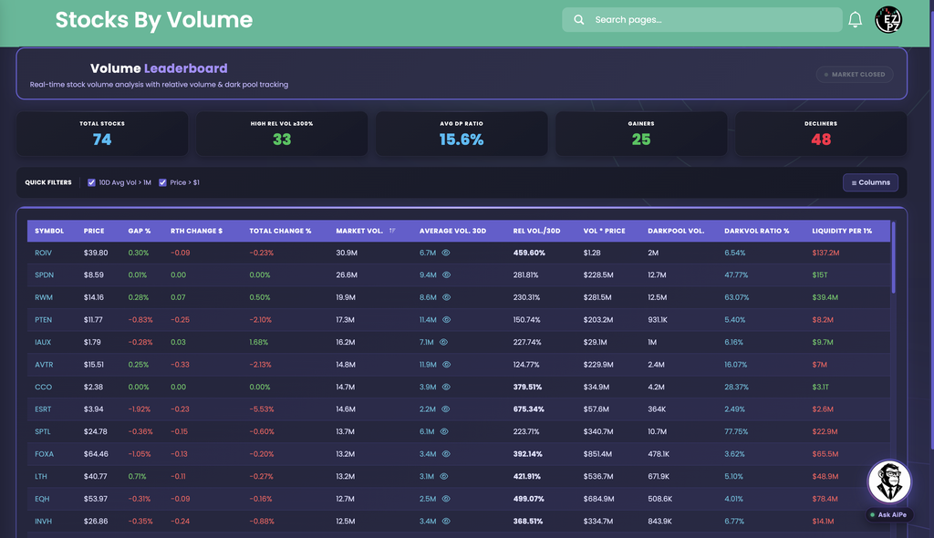
The screenshot shows how the read works. ROIV sits at the top with 30.9M Market Vol. against a 6.7M Average Vol. 30D, so Rel Vol./30D prints 459.60% in bold. Its Total Change % is -0.23%. That is heavy volume with almost no price move. SPDN prints 26.6M Market Vol. at 281.81% Rel Vol./30D, with 12.7M Darkpool Vol. and a 47.77% DarkVol Ratio %, so most of that volume traded off exchange.
How Volume Leaderboard differs from the rest of stocks-data
Volume Leaderboard ranks by how much stock traded and how that compares to normal. Market Dashboard is the one-screen overview of indices, breadth, and Market Direction lights. Top Gainers and Losers ranks by percent change. Gap Up and Down ranks the overnight gap. Extended Hours Leaders covers pre market and after hours. Range Change Leaders ranks the move from today's open to now. Here the sort is volume, and the question is whether volume is unusual for that name. For dark pool volume across names, DarkVol Leaders is the dedicated rank. For venue mix on one ticker, see Exchange Volume Leaderboard. For short-sale share of volume, see Short Volume. For options volume by strike, Volume Scan is a different job from share volume. When a name stands out, Ticker Explorer is the one-symbol dashboard.
Stat cards and Quick Filters
Five cards sit above the table. They summarize whatever rows are visible after your filters, so they change when you turn a filter on or off.
| Card | What you are looking at |
|---|---|
| Total Stocks | How many symbols are in the table right now. |
| High Rel Vol ≥300% | How many of those symbols are running at 300% or more of their 30 day average. The screenshot prints 33 of 74. |
| Avg DP Ratio | The dark pool share of total volume across the visible rows. Compare a single row's DarkVol Ratio % to it. |
| Gainers Decliners | How many visible symbols are up versus down on the day. |
Two checkboxes, both on by default.
- 10D Avg Vol > 1M: keeps liquid names with at least 1M average daily volume over 10 days.
- Price > $1: drops sub-dollar stocks.
Uncheck either one to widen the list. Expect more thin names and more extreme Rel Vol. readings when you do.
The Columns button on the right chooses which columns show, and the page remembers your choice.
- On by default: Symbol, Price, Gap %, RTH Change $, Total Change %, Average Vol.(30D), Rel.Vol/30D, Vol * Price, Darkpool Vol., DarkVol Ratio %, and Liquidity Per 1%.
- Off by default: Average Vol. and Rel. Vol. for 10D, 50D, and 90D.
Turn on a different window when 30 days is not the right baseline, for example 10D for a recent change in pace or 90D for a longer view.
Reading the columns
Read a row left to right: what it costs and how it moved, how much traded against normal, then where it traded.
| Column | What you are looking at |
|---|---|
| Symbol Price | The ticker and its last price. |
| Gap % | The gap from the prior close. Green is up, red is down. |
| RTH Change $ | Dollar change during regular trading hours. |
| Total Change % | Percent change from the prior close, including the gap. |
| Column | What you are looking at |
|---|---|
| Market Vol. | Shares traded today. This is the default sort. |
| Average Vol. 30D | Average daily volume over the window. The eye icon next to it opens a chart of that stock's average daily volume, titled with the ticker and the number of days. |
| Rel Vol./30D | Today's volume as a percent of that average. Bold means 300% or more. |
| Vol * Price | Dollar volume, so a cheap stock and an expensive one compare on money moved. |
| Column | What you are looking at |
|---|---|
| Darkpool Vol. | Shares that traded on dark, off-exchange venues today. |
| DarkVol Ratio % | Darkpool Vol. as a percent of total volume. Higher means more of the day traded off the public order book. |
| Liquidity per 1% | A dollar liquidity read for a 1% price move. Higher reads as a harder name to push around. Hover the header for the on-page note. |
How people actually use it
Check the cards first
High Rel Vol ≥300% tells you how many names are running hot. Avg DP Ratio gives the off-exchange baseline. Gainers against Decliners gives the day's bias.
Scan for bold Rel Vol.
Bold means 300% or more of normal. Those are the names trading at three times their usual pace, often on news or a repositioning.
Cross it with DarkVol Ratio %
High Rel Vol. with a DarkVol Ratio % well above Avg DP Ratio means the extra volume traded mostly off exchange. Low means it traded on lit venues.
Confirm with dollars and history
Read Vol * Price so a cheap stock does not fool you, then open the eye icon to see whether today's spike is unusual or a habit for that name.