Learn Center
Volume Surge Trades
Today's largest S&P 500 trade imbalance: buy versus sell dollars, dark pool versus lit exchange, by sector and by stock.
What are Volume Surge Trades and how do you read S&P 500 trade imbalance?
Volume Surge Trades is an EZPZ page that adds up the unusually large trades in S&P 500 stocks today and shows whether the dollars are leaning toward buying or selling. It splits that flow between dark pool and lit exchange venues, then breaks it down by sector and by individual stock.
The headline number is On-Balance Dollar Volume, which is total Buy $ Volume minus total Sell $ Volume across today's surge trades. A positive number means buy-side dollars dominate. A negative number means sell-side dollars dominate. Read it in layers. Start with the headline, then check how lopsided the Buy vs Sell pie is, then look at the Dark Pool vs Lit Exchange pie to see where the trading happened. The Daily Chart shows whether the imbalance built steadily or arrived in one burst. The sector and stock tables then show which groups and which tickers are behind it. Two limits apply. This is a measure of dollars already traded, so it describes today's pressure and does not forecast what price does next. And the page does not publish how a trade qualifies as a surge trade, so use the numbers as shown and do not try to rebuild them.
How the Volume Surge Trades page works on EZPZ
The page is titled S&P 500 Volume Surge Trades, with the subtitle "Unusually large trade imbalance, dark pool & lit exchange breakdown". It has no ticker box and no filters. Everything on it is one market-wide read, and the data loads when the page opens, so reload to pull a fresh snapshot.
What do the top row and the Daily Chart show?
Three cells sit in a row above the chart. The chart runs the full width below them.
| Panel | What you are looking at |
|---|---|
| On-Balance Dollar Volume | Net dollars for the day: Buy $ Volume minus Sell $ Volume across the tracked surge trades. Green when positive, red when negative. |
| Buy vs Sell $ Volume | A pie of the buy-side and sell-side dollar split, labeled with each percentage. A lopsided pie says more than a near-even one. |
| Dark Pool vs Lit Exchange | A pie of how much of that dollar volume traded off-exchange (Dark Pool $ Volume) versus on public exchanges (Lit Exchange $ Volume). |
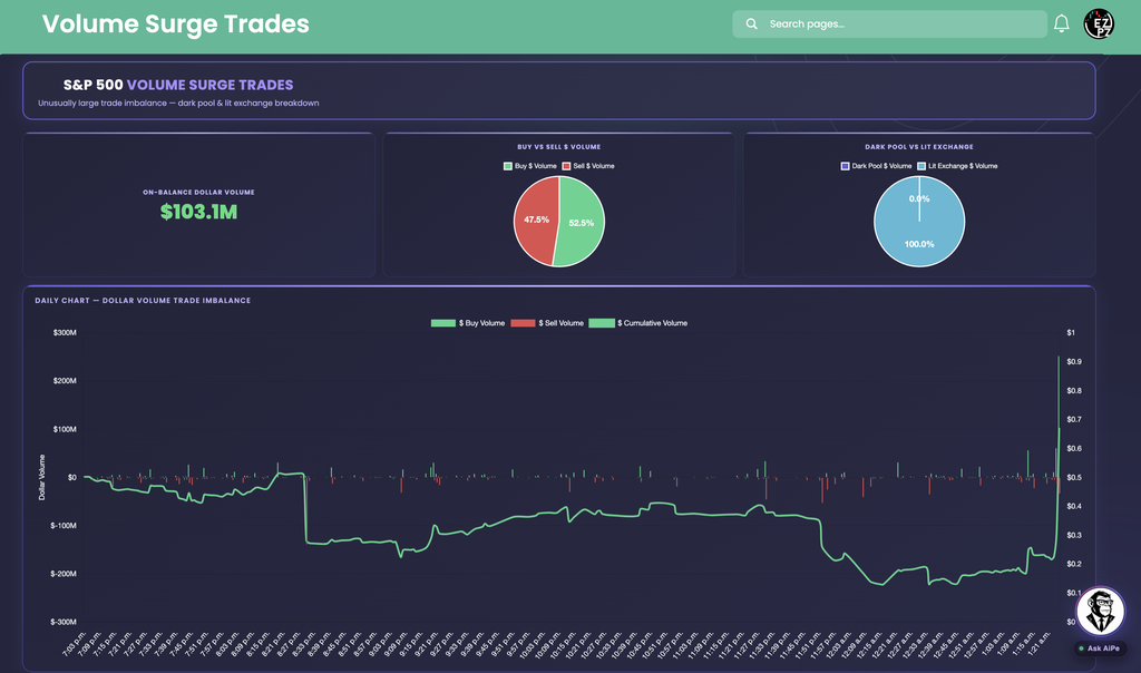
| Daily Chart, Dollar Volume Trade Imbalance | Green bars for $ Buy Volume above zero, red bars for $ Sell Volume below zero, and a $ Cumulative Volume line for the running net. Hover a point to see the dollar amount. |
The cumulative line is drawn against the left Dollar Volume axis. It is green when the day's net is positive and red when it is negative, so its color already tells you which side is ahead.
In this capture: On-Balance Dollar Volume is $103.1M in green. The Buy vs Sell pie reads 52.5% buy and 47.5% sell, so the net buying is real but not overwhelming. The Dark Pool vs Lit Exchange pie reads 0.0% Dark Pool and 100.0% Lit Exchange. On the chart, the cumulative line sits below zero for most of the session, bottoming out below negative $200M, then climbs sharply in the final buckets and ends positive, in line with the $103.1M headline. That is the point of the chart: the same +$103.1M could come from steady buying all day or from one late burst, and this capture is the late burst.
How do the sector and stock tables show who is behind the imbalance?

The sector table has one column per sector and three rows. Values are dollars in short form, so 338.4M is $338.4 million.
| Row | What you are looking at |
|---|---|
| On-Balance $ Notional | Net dollars for that sector: buy minus sell. Green when positive, red when negative. |
| Buy Dollar Volume | Total buy-side surge dollars in the sector, in green. |
| Sell Dollar Volume | Total sell-side surge dollars in the sector, in red. |
Below it, Largest Trade Imbalance by Stock shows two side-by-side tables with the same four columns.
| Column | What you are looking at |
|---|---|
| Symbol | The ticker. Top Buy Imbalance is on the left and Top Sell Imbalance is on the right. |
| Total Buy $ Volume | Buy-side dollars in that stock today. |
| Total Sell $ Volume | Sell-side dollars in that stock today. |
| $ Imbalance | Buy dollars minus sell dollars. The buy table shows it with a plus sign in green and the sell table in red, ranked by the size of the imbalance. |
In this capture: the sector row shows Technology at +338.4M on 500.4M of buying against 162.1M of selling, and Consumer Discretionary at +47.9M. On the other side, Industrials is at -159.9M with only 2.8M of buying against 162.7M of selling, and Real Estate is at -53M. Financials shows why the gross columns matter: 183.6M bought and 197M sold nets to just -13.5M, a busy sector with little net pressure. The sector nets add up to the $103.1M headline. In the stock tables, NVDA leads the buy side at +262.8M (329.5M bought, 66.7M sold), followed by AIG at +71M, AAPL at +50.8M, and SBUX at +34M. OTIS leads the sell side at -128.6M (1.2M bought, 129.8M sold), followed by SCHW at -60.8M and O at -51.4M. Compare the two totals before trusting the imbalance. AAPL is lopsided, 58.2M bought against 7.4M sold. WBD at +9.8M comes from 44.6M bought and 34.8M sold, a much more two-way tape. A value with no K or M, such as 351.6 for GOOGL Total Buy $ Volume, is a plain dollar amount.
How do you use the panels together, from headline to ticker?
- Read the headline sign. On-Balance Dollar Volume tells you which side leads and by how many dollars.
- Check the Buy vs Sell pie. Near 50/50 means the net is a small edge on heavy two-way flow. Closer to 70/30 means one side is clearly in control.
- Check the venue pie. A larger Dark Pool share alongside a strong imbalance points to off-exchange block activity. A mostly Lit Exchange split points to flow on public books.
- Read the Daily Chart shape. A steadily rising or falling cumulative line is persistent pressure. A flat line with one spike is a single burst.
- Find the sectors. Look for the largest positive and negative On-Balance $ Notional cells. An imbalance spread across many sectors is a broader message than one sector doing all the work.
- Drill to tickers. Use Top Buy Imbalance and Top Sell Imbalance to find the names carrying it, then open them in a per-ticker page.
How does Volume Surge Trades differ from other Stocks Analytics pages?
This page is about dollars, not price signals, and it covers the S&P 500 as one group. The regime pages, Intraday Regime Leaderboard, Swing Regime Leaderboard, and Investing Regime Leaderboard, give each symbol a score and a label for a holding period. Technical Analysis reads standard indicators on one symbol, and Top-50 Aggregate Technicals plots one indicator across the largest stocks. Predictive CandleScope is a forecast, while this page describes flow that has already traded. Top Money Flow, Market Price Action Trend, and Seasonal Returns each answer a different question. For related views outside this category, Dark Pool Sectors and Dark Pool Net Flow focus only on off-exchange trading, Volume Leaderboard ranks stocks by how much they traded compared with normal, and Ticker Explorer is the one-symbol dashboard for any name from the stock tables.
What do traders use Volume Surge Trades for?
Gauge the day's tone
Read On-Balance Dollar Volume and the Buy vs Sell pie to see whether large trades are leaning toward buying or selling across the S&P 500.
Find the leading sectors
Scan On-Balance $ Notional for the biggest positive and negative sectors, then check whether the imbalance is broad or concentrated.
Spot standout names
Use the Top Buy Imbalance and Top Sell Imbalance tables to find tickers with unusually one-sided dollar flow, then research them on their own pages.
See when the flow arrived
Watch the cumulative line on the Daily Chart to tell steady pressure from a single late burst before you read anything into the headline.