Learn Center
Social Sentiment
How the retail conversation about one stock leans, with positive, negative and neutral mention counts, average scores, and a score chart over time.
What is social sentiment for a stock?
Social sentiment for a stock is a count of how many public posts about it read positive, negative, or neutral, plus scores that summarize the mood. It measures the retail conversation, not analyst opinion or price. On EZPZ you load one ticker and read ten summary pills, a Sentiment Score Over Time chart, and a table of dated readings.
Read the balance, not the volume alone. A stock can be talked about a lot and still read evenly split, and a small crowd can lean hard one way. The page gives you both: the mention counts tell you how much conversation there was, and the scores and percentages tell you which way it leaned. Two limits matter. Retail chatter often follows a price move instead of leading it, so a positive reading after a rally is not a forecast. And automated scoring can misread sarcasm and slang, so a single reading is noisy. The page shows readings at dated times. It does not show which platform a mention came from or the posts themselves, so use it as a gauge of attention and mood, then check the news and the chart.
How the Social Sentiment page works on EZPZ
The page opens on AAPL. The header card shows the word Investing, the ticker, and a blue price badge such as AAPL $336.02. On the right, type a symbol into the box and press Enter or click Search. The box uppercases what you type. The page loads once and again on each search, and it does not refresh by itself. If a ticker has no price, the badge hides but the readings still load.
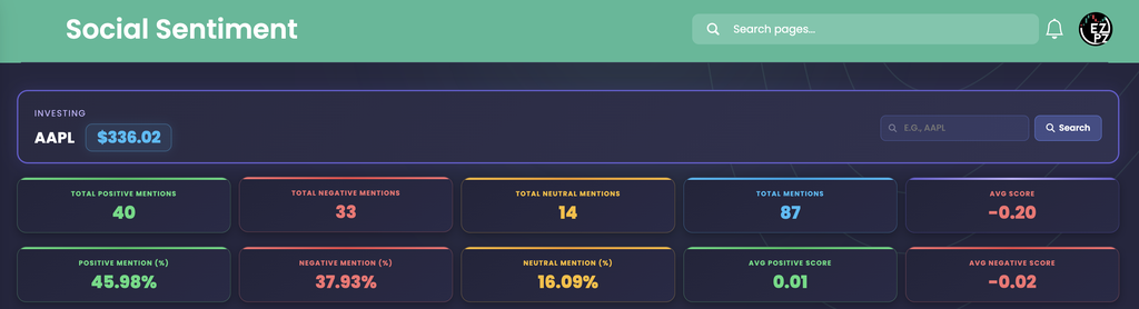
Below the header, the page stacks three blocks: the ten pills, a line chart, and a data table. Green always means positive, red negative, yellow neutral, and blue the total.
The ten stat pills
The pills add up or average every reading the page loaded, not just the ten rows visible in the table.
| Pill | What you are looking at |
|---|---|
| Total Positive Mentions | The Positive Mention column added across all readings. |
| Total Negative Mentions | The Negative Mention column added across all readings. |
| Total Neutral Mentions | What is left of Total Mentions after positive and negative are taken out. |
| Total Mentions | The Mention column added across all readings. |
| Avg Score | The average of the Score column. Its label and number turn green above zero and red below zero. |
| Positive Mention (%), Negative Mention (%), Neutral Mention (%) | Each total as a share of Total Mentions. The three add to 100 percent. |
| Avg Positive Score, Avg Negative Score | The averages of the Positive Score and Negative Score columns, fixed green and red. |
In the capture, 40 positive plus 33 negative plus 14 neutral makes 87 mentions, or 45.98%, 37.93%, and 16.09%. Avg Score reads -0.20, with an Avg Positive Score of 0.01 and an Avg Negative Score of -0.02.
The Sentiment Score Over Time chart

The chart plots three lines: Positive Score in green, Negative Score in red, and Overall Score in purple. It has one dot per reading, oldest on the left and newest on the right, and it covers every reading loaded, not only the ten in the table. Hover a dot to see its values. Click a name in the legend to hide that line.
Two things trip readers up. The horizontal axis lists readings evenly, so a 12 hour gap and a 3 hour gap take the same width. And the lines are smoothed, so the curve can bow above or below zero between two dots that are both zero. Trust the dots, not the curve between them. In the capture the first two readings sit at zero on all three lines, and at 21/09/2026, 03:30:00 the green line rises to about 0.03 while the red line drops to about -0.05, so the purple line lands near -0.02.
The data table

| Column | What you are looking at |
|---|---|
| Ticker | The symbol you searched. |
| At Time | When the reading was stamped, shown in your browser's time zone and date format. The table opens sorted by this column, newest first. |
| Mention | How many mentions the reading counted. |
| Positive Score, Negative Score | The reading's positive and negative scores. Negative Score prints as a negative number. |
| Positive Mention, Negative Mention | How many of the mentions were positive and how many were negative. Mention minus these two is the neutral count. |
| Overall Score | Positive Score and Negative Score added together. It is green at zero or above and red below zero. |
| Score | A separate score supplied with each reading. It runs on a different scale from Overall Score, so do not expect the two to match. |
| Dominant Sentiment | The larger of the positive and negative mention counts as a share of those two counts together. Green means positive led or tied, red means negative led. Neutral mentions are left out. |
The table shows ten rows per page and has no search box. Use the page controls under it to move to older readings.
Reading the AAPL example
All three readings in the capture counted 29 mentions each. The two older ones, at 20/09/2026, 12:30:00 and 21/09/2026, 00:30:00, split 16 positive to 8 negative, so Dominant Sentiment reads a green 66.67% (16 out of 24). Yet every score in those two rows reads zero. The newest reading, 21/09/2026, 03:30:00, flipped: 8 positive to 17 negative, a red 68.00% (17 out of 25), with a Positive Score of 0.0262, a Negative Score of -0.0494, an Overall Score of -0.02 and a Score of -0.6.
Two lessons come out of that. First, the counts and the scores can point different ways. In the older rows the counts lean positive while the scores are flat at zero, so do not assume a score is a rounded version of the counts beside it. Second, one row can drive a pill. Avg Score of -0.20 is the Score column (0, 0 and -0.6) averaged over three readings, so the newest reading alone sets it. With only three readings on the page, treat the pills as a snapshot of a very short window, not a trend.
How Social Sentiment differs from nearby Investing pages
This page answers "what is the retail crowd saying, and which way is it leaning?" It is a different crowd from the professionals covered on the neighboring pages. Recommendation Trends counts how many analysts rate a stock Strong Buy through Strong Sell each month. Upgrade and Downgrade logs each firm's rating change with the date. Price Target shows the price levels analysts expect. Ticker Performance shows what the price itself did, so you can set the mood beside the returns and moving averages. Support and Resistance marks the price levels where the stock has stalled before. When social readings swing, Company News and Market News are the first places to look for the cause, and Earnings Surprises covers the report that often sets the conversation off. Congressional Trading lists the stock trades that members of Congress have disclosed, another public record worth setting beside the crowd mood. Sector Metrics compares financial ratios against a whole sector, which is a fundamental view rather than a mood reading. Company Profile tells you what the company does and how large it is before you judge the crowd talking about it. Financial Statements shows the reported revenue, profit, debt and cash behind the chatter. For the standard fundamental ratios behind the company, Basic Financials groups valuation, profitability, growth, debt, and dividends for one ticker. Historical Market Cap charts a company's total value over dates you choose, a size view rather than a mood reading. Dividends lists a company's cash payments, a payout record rather than a mood reading. Analyst Estimates shows the forecasts analysts publish for revenue, EPS, EBITDA and EBIT, a professional view of the business rather than a mood reading.
Outside this category, Ticker Explorer is the one-symbol dashboard when you want a live quote and options context next to the sentiment you just read.
What to check before you rely on it
- Mention count first. A strong lean on a small Mention number is thin. Look at how many mentions sit behind a percentage.
- Counts against scores. If the Positive Mention and Negative Mention columns lean one way and the scores read zero, the reading is not telling you much.
- Direction across readings. A Dominant Sentiment that flips from green to red over consecutive readings is the change worth investigating.
- The dots, not the curve. The chart is smoothed and evenly spaced, so read values at the dots and check the timestamps in the table.
- The price and the news. Compare the reading with the price move and the headlines to see whether the crowd led or followed.
Who uses social sentiment
Traders after a surprise move
Check whether the conversation picked up alongside a sudden price move on a ticker they follow.
Attention watchers
Spot names whose Total Mentions jump, then open the news to find out why.
Contrarian readers
Ask whether a one-sided reading means a move is already crowded and due for a pause.
Investors doing research
Set the retail mood beside analyst ratings and price targets before deciding what to trust.