Learn Center
Money Sentiment
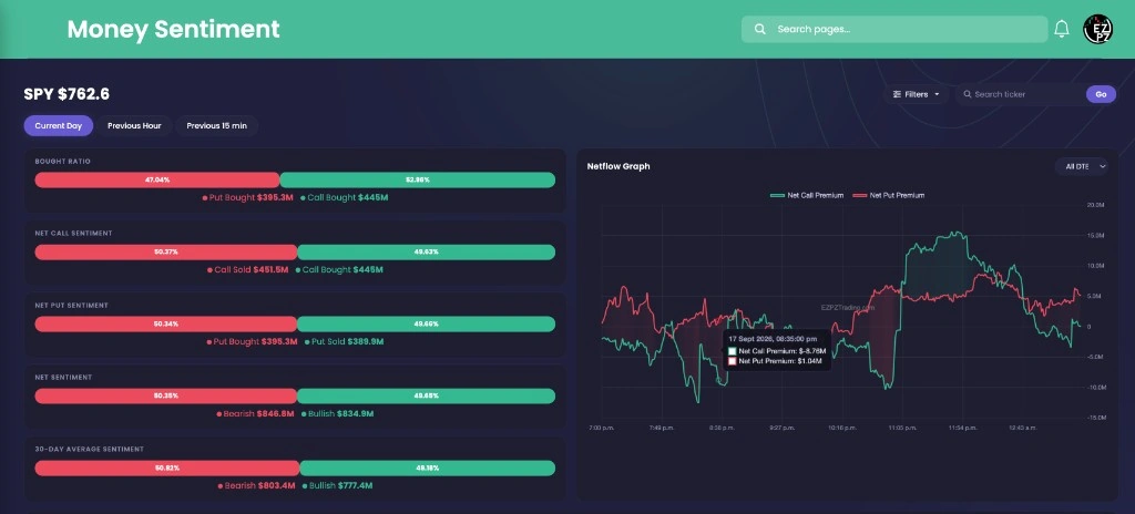
Bought Ratio, Net Sentiment, and Netflow Graph for one ticker, with Current Day, Previous Hour, and Previous 15 min.
What is money sentiment?
Money Sentiment is a one-ticker gauge of how options premium is split between buying and selling. Bought Ratio sits on top. Net Call Sentiment, Net Put Sentiment, Net Sentiment, and 30-Day Average Sentiment sit under it. Netflow Graph is the session chart beside those bars. A bar lean is not a trade.
A tape shows prints. Net Flow Graph shows a running line of Net Call Premium versus Net Put Premium. This page starts with stacked bars. Bought Ratio is Put Bought versus Call Bought. Net Call Sentiment is Call Sold versus Call Bought. Net Put Sentiment is Put Bought versus Put Sold. Net Sentiment is Bearish versus Bullish. 30-Day Average Sentiment is the same Bearish / Bullish split over a longer window. Either side can still be a hedge, a spread, or a dealer book.
Netflow Graph on the right is Net Call Premium and Net Put Premium through the session. All DTE starts selected. The doughnut row under that is one pie per expiration, with Calls Bought, Calls Sold, Puts Bought, and Puts Sold. Each pie also has a Bearish / Bullish bar. None of those charts is a buy or sell. Current Day is today's running picture. Previous Hour and Previous 15 min change the window, not the job.
On EZPZ, the live page title is Money Sentiment. The page starts on SPY. Current Day is the default view. The search box placeholder is Search ticker. Go loads the name. Filters sit next to that search. Net Flow Graph is one ticker you search with Filter ticker, plus Cumulative Volume Delta, not these bars. Market Wave is the Current Day chart of Net Call Premium versus Net Put Premium without Bought Ratio. Movers and Shakers Tide is that chart job for about 18 mega-cap names. Historical Net Premium is the 15D Cumulative lookback with a daily table. 0DTE Graph is the same-day premium chart with Filter ticker. The 0DTE dropdown is the lock. Weekly-DTE Graph is the WTE chart of premium that expires by Friday. 7-DTE Graph is the 7DTE chart of premium in the next 7 days. Supply and Demand X-ray is the ITM Call and Put chart of Price, Supply, and Demand. Index Trader is the index dashboard with Premium Traffic Lights. Ticker Explorer is the one-symbol dashboard. Net Call Premium there is a card, not this bar stack. Largest Premium By Tickers is the Bullish Flow / Bearish Flow leaderboard when you do not have a name yet. Top 20 Optionable ranks listed-option names by Vol. * Price. Gamma Exposure is the strike table with Call Wall and Put Wall. Market Maker Exposure is the SPX Flip Level chart with Call Wall, Put Wall, and Expected Move(VEM) and DEM. Market Cross Flow is the SPY, SPXW, and QQQ GEX grid next to candles. Greeks Heatmap is the strike-by-expiration grid with Gravity Magnet Score. Option Depth Flow is the searchable strike-by-time Bubble or Gradient chart. Net Premium Heatmap is the strike-by-expiration grid of Net Premium for one ticker. Live Flow is the tape of prints. Unusual Activity keeps only large, sweep, and block prints. Unusual Activity Intraday is the session scan with a date range. $1M Plus Flow keeps only million-dollar premium. 0DTE Flow keeps only prints that expire today. SPX and SPY Flow locks the tape to SPX, SPXW, and SPY. Option Chain is the listed book for one ticker. GEX Heatmap is the strike-by-expiration GEX grid with a GEX Details table. GEX and DEX is the Intraday GEX and DEX chart pair with Gamma Flip. Spot Gamma and Delta is the ($) Open Interest versus ($) Volume bar pair with a Spot line. Expected Move is the DEM and VEM band chart by expiration. Put to Call Ratio is the Intraday Put/Call Ratio chart of Traded PCR, OI PCR, and Sentiment PCR. Max Pain is Intraday Max Pain with O-Max Pain, P-Max Pain, and V-Max Pain. Open Interest Scan is the OI per Strike and OI per Expiration chart pair. Volume Scan is the Volume by Strike and Volume by Expiration chart pair. Volatility Analysis is Volatility By Open Interest, Open Interest, and Implied Volatility Smile for one ticker. IV Rank Explorer is Current IV (30D), IV Rank (1Y), period IV Rank, and IV Percentile (1Y) plus the IV Rank chart. Historical Volatility is 10D through 90D Volatility versus Price. Volatility Surface 3D is Raw Contracts and Smoothed Mesh for one ticker.
How Money Sentiment works on EZPZ
Search a ticker, leave Current Day on, then read Bought Ratio first. It is not a combined rating. If Bought Ratio looks one-sided, read Net Sentiment next, then 30-Day Average Sentiment. Open Netflow Graph if you want the session lines. Scroll to the expiration pies if you want Calls Bought versus Puts Sold on each date. Open Filters if you want ITM, OTM, or an expiration type.
How this differs from Net Flow Graph
Net Flow Graph is a session chart you search with Filter ticker. It adds Cumulative Volume Delta, Market Price Action Trend, and Dark Pool Flow. This page is the bar stack first. Netflow Graph here sits beside Bought Ratio, with All DTE or 7 DTE. Use Net Flow Graph when you want CVD and the lower charts. Use this page when you want Bought Ratio, Net Sentiment, and one pie per expiration. Use Market Wave when you want Current Day and Historical without these bars. Use Movers and Shakers Tide when you want the 18-name basket. Use Historical Net Premium when you want the 15D table. Use 0DTE Graph when you want same-day premium. Use Weekly-DTE Graph when you want Friday. Use 7-DTE Graph when you want the next 7 days. Use Supply and Demand X-ray when you want Price, Supply, and Demand on each contract. Use Index Trader when you want traffic lights. Use Ticker Explorer when you want quote, PCR, GEX charts, and unusual activity. Use Largest Premium By Tickers when you still need a name. Use Top 20 Optionable when you want Vol. * Price rank. Use Gamma Exposure when you want Call Wall and Put Wall. Use Live Flow when you want the prints.
Anatomy of the bars and charts
You do not need every bar on every ticker. Use the tabs if you want a map of the fields.
The left column is five metric cards. Each bar is a split, not a score.
| Card | What you are looking at |
|---|---|
| Bought Ratio | Put Bought (red) versus Call Bought (green), as percent and dollars. |
| Net Call Sentiment | Call Sold (red) versus Call Bought (green). |
| Net Put Sentiment | Put Bought (red) versus Put Sold (green). |
| Net Sentiment | Bearish (red) versus Bullish (green) for the current window. |
| 30-Day Average Sentiment | The same Bearish / Bullish split over the 30-day average, not today's last tick. |
The right card is labeled Netflow Graph. All DTE starts selected. 7 DTE is the other option.
| Line | What you are looking at |
|---|---|
| Net Call Premium | Green. Call-side premium through the session. |
| Net Put Premium | Red. Put-side premium through the session. |
| All DTE | The default dropdown. Switch to 7 DTE if you only want premium in the next 7 days on this chart. |
Each doughnut is one expiration date. The shared legend is Calls Bought, Calls Sold, Puts Bought, and Puts Sold.
| Slice | What you are looking at |
|---|---|
| Calls Bought | Green. Call premium tagged as bought on that expiration. |
| Calls Sold | Red. Call premium tagged as sold. |
| Puts Bought | Dark red. Put premium tagged as bought. |
| Puts Sold | Light green. Put premium tagged as sold. |
| Bearish / Bullish | The bar under each pie. Same labels as Net Sentiment, for that expiration only. |

Filters
- Moneyness: ITM and OTM start checked.
- Expiration Type: Fridays (W), OpEx (M), or All (D, W, M). All starts selected.
Views
- Current Day is the default.
- Previous Hour and Previous 15 min shorten the window.
- The ticker badge is the name you loaded, plus last price. The page starts on SPY.
Toolbar
The chrome around the bars is how you change the ticker and the window, not how you score it.
- Ticker badge: The underlying and last price. The page starts on SPY.
- Filters: Moneyness and Expiration Type.
- Search ticker / Go: Loads another name for the bars, Netflow Graph, and pies.
- Current Day / Previous Hour / Previous 15 min: The three views.
- All DTE / 7 DTE: Only on Netflow Graph.
How people actually use it
Start on Current Day
Leave SPY on, or search a ticker you already care about. Read Bought Ratio first. You are watching a split, not picking a strike.
Check Net Sentiment next
If Bought Ratio looks one-sided, see whether Net Sentiment and 30-Day Average Sentiment agree. A split between today and the 30-day bar is a prompt, not a fade.
Use Netflow Graph for shape
The bars are a snapshot. Netflow Graph shows whether Net Call Premium or Net Put Premium built through the session. Leave All DTE on unless you want 7 DTE.
Use it next to the other tools
This page is the gauge. Open Net Flow Graph for CVD. Open Live Flow if a lean makes you want the prints.