Learn Center
Predictive CandleScope
A probabilistic 24-hour price forecast built on the Predictive CandleScope research paper, with a ranked Alpha Board and a members-only SPY Intraday view.
What is Predictive CandleScope and how does it forecast the next 24 hours?
Predictive CandleScope is a probabilistic price forecast for a stock, drawn on top of its recent hourly candles. Instead of one predicted line, it simulates many possible paths for the next 24 hours and shows the average path, a shaded range around it, and a few stat cards. EZPZ builds it on the Predictive CandleScope research paper (PDF).
The forecast comes from a time-series foundation model that reads the last 512 hourly candles for the ticker and runs 30 independent Monte Carlo samples for the next session. The orange line is the mean of those 30 paths. The red and green lines mark the upper and lower edges of the 10th to 90th percentile range, so roughly 90% of the simulated outcomes sit inside the band. A narrow band means the paths agree. A wide band means they do not, and the forecast is a rougher guide. Upside Probability, the first card, is the share of the 30 paths that finish above the last known close. The page has three tabs: Predictive CandleScope for any ticker, Predictive Alpha Board for a ranked table of every tracked symbol, and SPY Intraday, a members-only SPY view. The forecast is a distribution of possibilities, not a promise, and it is not a recommendation to buy or sell.
How the Predictive CandleScope page works on EZPZ
A row of three tab buttons sits at the top of the page. Predictive CandleScope opens first. Below it, the header reads Live SPY Forecast Dashboard, or the ticker you load.
- Ticker box and GO: type a symbol and press GO or Enter to load its forecast. It opens on SPY. The box is hidden on the SPY Intraday tab.
- Info button: the round i button opens How Predictive CandleScope Works, a short legend for the chart lines, the stat cards, and the update schedule.
- Last Updated: shows when the loaded forecast was generated. Next to it the page notes Interval: 1-Hour and that times are in your local timezone.
- Research link: under the section heading, Read the science behind it (Download PDF) opens the same research paper this guide links to.
- Ask AiPe: the AiPe assistant sits in the corner. It reads the loaded ticker, the cards, and the forecast band, and it can switch the ticker or the tab for you.
Pick a tab below to see what each screen shows and a worked example from a real capture.
What does each tab on Predictive CandleScope show?
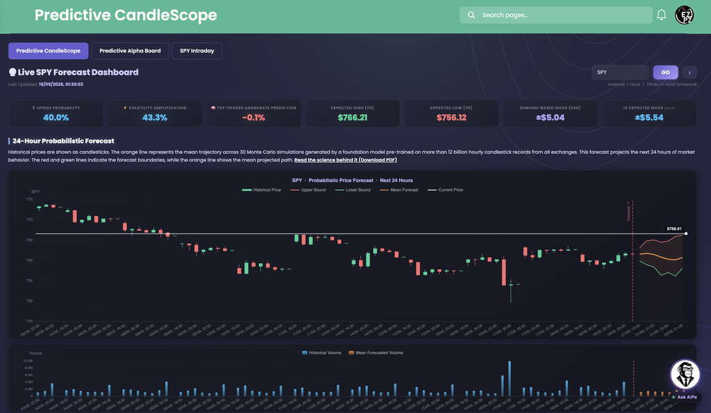
This is the default view. Load any ticker and read the cards first, then the chart. Everything to the right of the red dashed Forecast line is projected. Everything to its left is history.
| Card | What it shows |
|---|---|
| Upside Probability | The share of the 30 sampled paths whose final price is above the last known close. Above 60% is a bullish lean, below 35% is a bearish lean, and in between is closer to a coin flip. |
| Volatility Amplification | How much more volatile the model expects the session to be than the recent past, scaled 0 to 100%. High values mean a wider-than-usual range in either direction. |
| Top Tickers Aggregate Prediction | The average predicted price change, in percent, across the tracked tickers. It is a broad market read, not a forecast for the loaded symbol. |
| Expected High (7H) and Expected Low (7H) | The model's expected price range over the next seven hours, in dollars. |
| Demand-Based Move (24H) | The expected size of the 24-hour move, shown as plus or minus dollars, built from demand data. |
| IV Expected Move | The move the options market itself is pricing in, shown as plus or minus dollars with the expiry's days to expiration in small type. It is a separate cross-check against the model. |
| Chart piece | What you are looking at |
|---|---|
| Historical Price | Hourly candlesticks for roughly the last 12 days. |
| Mean Forecast | The orange line, the average across the 30 sampled paths. |
| Upper Bound and Lower Bound | The red and green lines that frame the shaded 10th to 90th percentile range. |
| Current Price | The white line, with the latest price tagged at the right edge, updated during market hours. |
| Volume chart | Historical Volume in blue and Mean Forecasted Volume in orange, on the same time axis. |
In this capture: Upside Probability is 40.0% and Volatility Amplification is 43.3%, so the lean is a little below a coin flip and the expected range is moderate. Top Tickers Aggregate Prediction is -0.1%. Expected High (7H) is $766.21 and Expected Low (7H) is $756.12. Demand-Based Move (24H) is plus or minus $5.04 and IV Expected Move is plus or minus $5.54, so the model and the options market are within about $0.50 of each other.
The chart shows a live-versus-forecast read. The Current Price line is tagged at $766.61, which is above the $766.21 Expected High (7H) and near the top of the forecast band, while the orange mean line drifts slightly down. That means the session is running hotter than the model's median expectation. The forecast band is the reference, not a ceiling.

The Alpha Board ranks every tracked symbol's latest 24-hour forecast in one table, produced by the same model as the CandleScope tab. Use it to find which names the model leans toward most, then click a symbol to open its full chart on the CandleScope tab in a new browser tab.
| Piece | What you see |
|---|---|
| Total Symbols | How many symbols are in the table right now. It shrinks when you filter. |
| Avg Upside Probability | The mean Upside Probability across the symbols shown. |
| Bullish and Bearish | Counts of symbols at 60% Upside Probability or higher, and at 35% or lower. |
| Filters | Search takes a symbol. Min Upside % hides symbols below the number you enter. Apply runs the filter and Reset clears it. A Last updated stamp sits at the right. |
| Paging | The table shows 100 symbols per page, with a Showing count and Prev, Next, and page buttons underneath when the list is longer. |
| Column | What you are looking at |
|---|---|
| # | Rank in the current sort. |
| Symbol | The ticker. Click it to open that symbol's forecast on the CandleScope tab. |
| Upside Probability | The share of the 30 sampled paths ending above the last close, with a bar. The default sort, highest first. |
| Prediction % | The model's predicted percentage price change. |
| Volatility Amplification | A color-coded badge for how much more volatile the model expects that symbol to be than its recent history. |
| Forecast High and Forecast Low | The expected price high and low for the forecast window, in dollars. |
| Last Updated | When that symbol's forecast was generated. |
Click any column header to sort by it, and click again to reverse the order.
In this capture: Total Symbols is 63 and Avg Upside Probability is 47.3%. Bullish is 16 and Bearish is 18, so the model is close to evenly split. The top of the table reads C at 96.7%, MS at 90.0%, GS at 86.7%, and HD at 83.3%.
Compare the range columns before you rank by probability alone. C reads 96.7% with a Volatility Amplification of 43.3% and a forecast range of $130.50 to $136.48, about $6 wide. GS reads 86.7% with a Volatility Amplification of 76.7% and a range of $923.93 to $989.79, about $66 wide. Both lean up, but GS carries a much wider expected swing.

SPY Intraday is a SPY-only version of the forecast. The ticker box and GO button are hidden, the header reads Live SPY Intraday Forecast Dashboard, and the chart is titled SPY, Intraday Probabilistic Forecast. It uses the same cards and chart pieces described on the CandleScope tab.
In this capture: Upside Probability is 40.0%, Volatility Amplification is 43.3%, Expected High (7H) is $766.21, Expected Low (7H) is $756.12, and IV Expected Move is plus or minus $5.54, the same readings as the CandleScope tab in the shot above. Only the Current Price tag differs, at $766.99 here against $766.61 there. Use the Last Updated line to see how fresh the forecast behind the cards is.
How do you read Upside Probability, the forecast band, and IV Expected Move together?
- Start with Upside Probability. Well above 50% leans bullish, well below leans bearish, and near 50% is a toss-up. Above 60% and below 35% are the page's own bullish and bearish marks.
- Check Volatility Amplification. A high reading means the model expects a bigger range regardless of direction, so treat the band as less precise that day.
- Judge the band width. A tight 10th to 90th percentile band means the 30 paths agree. A wide band means they disagree and the forecast is a rough guide.
- Cross-check IV Expected Move. If the options market's implied move is far bigger or smaller than the model's range, the two independent reads disagree. That gap is worth noting.
- During market hours, watch the white line. If price tracks the orange mean, the forecast is holding. If it is pinned to the upper or lower bound, the session is running hotter or colder than the median path.
- Use the Alpha Board to find names, then open the chart. Sort by Upside Probability, filter with Min Upside %, and click a symbol to read its full forecast.
How does Predictive CandleScope differ from other Stocks Analytics pages?
Most pages in Stocks Analytics describe price that has already traded. Predictive CandleScope is the one that projects a range for what may come next, and it says how sure it is through the band width.
- Technical Analysis shows Buy, Neutral, and Sell gauges from indicators on past prices. CandleScope simulates future paths instead.
- Top-50 Aggregate Technicals plots one indicator across the fifty largest stocks. The Alpha Board ranks tracked symbols by forecast Upside Probability.
- Intraday Regime Leaderboard, Swing Regime Leaderboard, and Investing Regime Leaderboard score the current market regime for each horizon. CandleScope forecasts a price range for the next 24 hours.
- Volume Surge Trades, Top Money Flow, Market Price Action Trend, and Seasonal Returns cover volume, money flow, price trend, and calendar patterns.
To check the IV Expected Move card against the full options picture for a ticker, open Ticker Explorer.
What do traders use Predictive CandleScope for?
Frame the day's range
Read Expected High (7H), Expected Low (7H), and the band before the open, then compare them with IV Expected Move to see whether the model and the options market expect a similar range.
Find names the model leans on
Sort the Alpha Board by Upside Probability, set Min Upside % to 60, and open the top symbols to check band width and Volatility Amplification.
Track price against the forecast
During market hours, watch whether the white Current Price line stays near the orange mean or pushes toward a bound. It shows whether the session is running hotter or colder than expected.
Get a SPY-specific view
Members can open the SPY Intraday tab for a dedicated SPY view, and use Top Tickers Aggregate Prediction as a broad market lean.