
Learn Center
Sector Metrics
Financial metrics for a whole sector, each shown as an Actual reading beside its Median, so you can judge one company against a group.
What are sector metrics and how do you read them?
Sector metrics are financial measures calculated for a whole sector instead of one company, such as asset turnover, current ratio, dividend yield and growth rates. On EZPZ you pick a sector and get a table with each metric's Actual reading beside its Median, so you can see what is normal for a group of companies before judging any single stock against it.
A valuation multiple, a margin or a growth rate means little until you know what the sector around it looks like. A dividend yield of 4 is high for one sector and ordinary for another, so the same stock can look cheap or expensive depending on the yardstick. This page supplies the yardstick. Read each row as a pair. When Actual and Median sit close together, the sector is fairly uniform on that measure. When Actual sits far from Median, a few extreme readings are probably pulling one of the two numbers away from the middle, and the Median is usually the steadier guide to what a typical company looks like. Sign matters too. A positive number prints green and a negative number prints red, and the two columns can disagree, as they do on capital spending growth in the capture below. This page describes sectors, not tickers. It is background for research on a stock, not a signal and not a valuation call.
How the Sector Metrics page works on EZPZ
The page has two blocks. A Select Sector bar holds one dropdown, and a Sector Metrics card below it holds a three column table with the headers Metric, Actual and Median. There is no ticker box. When the page opens it loads every sector in one request, fills the dropdown, and shows the first sector in the list, which is Communication Services in the capture. Choosing another sector swaps the table instantly, with no new request. A spinner shows while the first load runs, and the page does not refresh on its own after that, so reload it to pull new numbers.
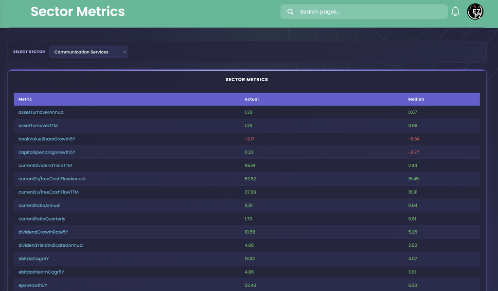
In this capture the Actual column is above the Median on almost every row. Asset turnover reads 1.33 against 0.67 on the annual row and 1.23 against 0.68 on the TTM row. The two current ratio rows show a wide gap, 5.51 against 0.84 on the annual reading and 1.73 against 0.81 on the quarterly one. Growth rows split more interestingly. Capital spending growth reads 11.23 in Actual and -5.77 in Median, so the sector figure is green while the typical company reads red. Book value per share growth is negative in both columns (-2.17 and -0.34), while EBITDA compound growth is positive in both (13.82 and 4.07). The row to be careful with is currentDividendYieldTTM, which reads 95.91 in Actual against 2.44 in Median. A dividend yield near 96 is not something a group of companies pays, so treat that Actual as a reading to question, and lean on the Median beside it.
How Sector Metrics differs from the rest of investing
Sector Metrics is the only page in this category that compares a metric against a whole sector. Basic Financials lists valuation, profitability and growth numbers for one company, which is what you would line up against a sector row here. Company Profile tells you which industry a company sits in, and Financial Statements holds the reported figures behind ratios like these. Ticker Performance covers what the price did, with returns, moving averages and 52 week ranges. Historical Market Cap charts a company's size over a date range, and Dividends covers payouts, which you can hold up to the dividend rows here. Earnings Surprises and Analyst Estimates look at reported results and forward numbers. Recommendation Trends, Upgrade and Downgrade and Price Target show what analysts think, Social Sentiment shows the retail mood, and Support and Resistance marks levels where price has stalled before. Congressional Trading lists stock trades that members of Congress have disclosed, and Company News and Market News cover the headlines behind a move.
Outside this category, Peter Lynch Fundamental Screener applies fixed fundamental cutoffs to a list of stocks, which is a different question from where a sector sits. Ticker Explorer is the one-symbol dashboard when you want a live quote and options context next to the fundamentals you just checked.
Reading the metric names
The Metric column prints the raw field names, in camel case, with no units and no friendly labels. The suffixes follow common finance conventions. The page does not define them, so use these as a general reading guide.
| Part of the name | What it usually means |
|---|---|
| Annual TTM Quarterly | The period behind the reading. Annual is a fiscal year, TTM is the trailing twelve months, and Quarterly is a single quarter. The same measure can appear in more than one period, such as assetTurnoverAnnual and assetTurnoverTTM. |
| 3Y 5Y | A growth or change measured over three or five years, as in epsGrowth3Y and dividendGrowthRate5Y. |
| assetTurnover | How much revenue a company generates for each dollar of assets. Higher means the assets are worked harder. |
| currentRatio | Short term assets compared with short term obligations, a common liquidity check. |
| currentEv/freeCashFlow | Enterprise value compared with free cash flow, a valuation multiple where lower means cheaper on cash generation. |
| currentDividendYieldTTM dividendYieldIndicatedAnnual | Two ways to express dividend yield, one from trailing payouts and one from the indicated annual payout. |
| ebitdaCagr5Y ebitdaInterimCagr5Y | Compound annual growth in EBITDA over five years, the second measured on interim periods. |
| bookValueShareGrowth5Y capitalSpendingGrowth5Y | Five year growth in book value per share and in capital spending. |
The list continues below the capture with more metrics in the same style. Scroll the page to reach them.
The controls and columns
| Control or column | What you are looking at |
|---|---|
| Select Sector | A dropdown listing the sectors alphabetically. In the capture it offers Communication Services, Consumer Discretionary, Consumer Staples, Energy, Financials, Health Care, Industrials, Information Technology, Materials, N/A, Real Estate and Utilities. N/A collects companies with no sector assigned. |
| Metric | The metric's field name, sorted A to Z by default. |
| Actual | The sector level reading for that metric, to two decimals. Green above zero, red below zero, and uncolored at exactly zero. The page does not say how it is built. |
| Median | The middle reading for that metric, to two decimals, colored the same way. Because a median ignores extremes, it is the steadier of the two columns when a sector has outliers. |
Working the page
- Pick a sector: open the dropdown and choose one. The table replaces itself at once. The page opens on the first sector alphabetically, so it is not a ranking of sectors.
- No search or paging: there is no search box, no page controls and no row count. The whole metric list is one long table, so scroll to read it.
- Missing values: a metric with no number shows a dash in place of Actual or Median.
- Same rows, new numbers: every sector shows the same metrics, so switching sectors is the fastest way to compare one row across the market.
- Blank page: if the data request fails, the dropdown and table simply stay empty with no message. Reload the page to try again.
- Sectors are not companies: there is no way to see which stocks sit behind a reading. Use a company page to check one name against the sector row.
How people actually use it
Is that multiple high or normal?
Take a stock's free cash flow multiple from a company page and hold it against the matching sector Median. In the capture the Communication Services Median is 15.45 on the annual row and 16.91 on the TTM row.
Spot skewed sectors
Scan for rows where Actual and Median are far apart or have opposite signs. That gap tells you the sector is uneven on that measure and a single average would mislead.
Compare sectors on one metric
Switch the dropdown and read one row, such as currentRatioAnnual or epsGrowth3Y, across sectors to see where growth or liquidity runs high.
Add context to a screen
After a screen turns up a name, check whether its ratios are unusual for its sector or just typical of it before you spend time on it.