Learn Center
Market Dashboard
A single screen that pulls together index levels, market breadth, a sector heat map, and Market Direction lights driven by options premium.
How do you read the Market Direction lights on the EZPZ Market Dashboard?
Market Direction by premium is a row of eight traffic lights, one each for SPX, IWM, NDXP, RUTW, QQQ, SPY, M & S, and VIX, that turns green, red, or amber depending on which side, calls or puts, is currently carrying more options premium in that name, not which way price last ticked.
The Market Dashboard puts that signal next to everything else you would otherwise check one tab at a time: candle charts for DOW, NASDAQ, S&P 500, and RUSSELL 2000, market breadth cards for Advancing versus Declining and New High versus New Low, a Market Price Action Trend chart, a Movers and Shakers Tide chart of mega cap options premium, a sector treemap you can filter by cap group and weight, and ranked Top Gainers, New Highs, Top Losers, and New Lows tables. On EZPZ, all of it loads on one screen and updates live during the session. Use Top Gainers and Losers or Volume Leaderboard when you want a full sortable ranking instead of the compact tables shown here.
How the Market Dashboard works on EZPZ
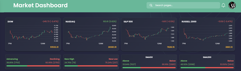
The top of the page is four index candle charts (DOW, NASDAQ, S&P 500, RUSSELL 2000) with the day's change and last price, followed by four breadth cards. Breadth measures how many stocks are actually participating in the move, not just the index level.
| Card | What you are looking at |
|---|---|
| DOW NASDAQ S&P 500 RUSSELL 2000 | Intraday candles from 7PM through the current session, with the point change and percent change top right and the last price bottom right. |
| Card | What you are looking at |
|---|---|
| Advancing Declining | Percent and count of stocks up versus down in the current universe. A bar fills green for advancing, red for declining. |
| New High New Low | Percent and count of stocks printing a new high versus a new low. |
| SMA50 SMA200 | Percent of the universe trading above versus below its 50 day and 200 day moving average, a read on shorter and longer term trend health. |
Market Direction lights and the two chart panels

The lights
Green reads bullish, red reads bearish, and amber reads neutral or mixed for that index or ETF. M & S is the Movers and Shakers composite: the mega cap, high options volume names that carry most of the index's directional moves. EZPZ does not publish how the color is weighted.
The two charts
- Market Price Action Trend: the white line is institutional (dark pool) clustered price against a shaded trend band. Price running above the band reads bullish, below reads bearish. Green and red EMA Cross markers flag where that trend has flipped.
- Movers and Shakers Tide: SPY price in gray against Net Call Premium and Net Put Premium for the same mega cap names behind the M & S light, so you can see whether calls or puts are leading the tape.
Filter the sector treemap

Filters
- Market cap: Micro, Small, Mid, Large, Mega. All five are on by default; use the Cap Groups dropdown to narrow the set.
- Weight: Market Cap by default. The dropdown also offers Volume to ADV, Volume, and Share Outstanding.
- Security groups: S&P 500 by default. The Index dropdown also has Dow Jones 30, NASDAQ-100, RUSSELL 2000, and All Stocks.
Box size follows the weight metric you pick. Color is green for a positive move and red for a negative one, deeper for a bigger swing. Hover a box for price and percent change.
Top Gainers, New Highs, Top Losers, and New Lows

Columns
- Ticker Price Change Volume Signal
The left table stacks Top Gainers above New High rows; the right table stacks Top Losers above New Low rows. The Signal column tags which list a row came from, so a name that is both a top mover and a new high or low shows up twice.
How Market Dashboard differs from the rest of stocks-data
Market Dashboard bundles a compact Top Gainers/New Highs table and a Top Losers/New Lows table alongside indices, breadth, and the treemap, but it is not a full ranking tool. Top Gainers and Losers ranks the entire universe by percent change with real filters. Volume Leaderboard ranks by raw or relative volume. Gap Up and Down ranks the overnight gap. Extended Hours Leaders covers pre market and after hours moves. Range Change Leaders ranks the move from today's open to now. Use Market Dashboard for the one screen overview, then open one of those pages when you want to dig into a specific ranking. For a single name after you already have one in mind, Ticker Explorer is the one ticker dashboard.
How people actually use it
Start the session
Check the four index candles and the breadth cards first for the day's headline move and whether it is broad or narrow.
Confirm or contradict
Read the Market Direction lights against that headline. A green SPX light on a red day, or the reverse, is worth a second look.
Check confluence
Compare the Market Price Action Trend chart with the Movers and Shakers Tide chart. Agreement reinforces the read; a split between the two is a flag.
Find the names
Scan the treemap by cap group and weight, then check the Top Gainers/New Highs and Top Losers/New Lows tables for a specific ticker to research next.