Learn Center
Ticker Performance
One stock at a glance: price returns, SMA and EMA moving averages, and 1 month to 52 week highs and lows on one screen.
What is the Ticker Performance page and how do you read it?
Ticker Performance is a one-symbol snapshot of where a stock trades against its own recent history. It puts price returns from five days to twelve months, simple and exponential moving averages from five to two hundred days, and one month to 52 week highs and lows on one screen, with a table of exact values under the charts.
Each of the three charts answers a different question. Price Returns asks how much the stock has gained or lost over each window. Moving Averages asks whether recent prices sit above or below older ones. High / Low Price Ranges asks how far the stock has traveled inside each window. Read them together. A stock with green bars across every window, moving averages that step up from the 200-Day to the 5-Day, and a price close to its 52-Week High is trending and extended. A stock with a red 1-Month bar, averages that step down toward the right and a price near its lows is under pressure. When the charts disagree, for example a big 12-Month gain with a red 1-Month bar, the trend may be pausing or turning. This page describes past price behavior only. It is a first pass on a ticker you are already researching, not a signal.
How the Ticker Performance page works on EZPZ
The page opens on SPY. The header card shows the word Investing, the ticker with its current price in a blue badge, and the line "Moving averages, price returns & high/low ranges". On the right sit an Enter Ticker box and a Go button. Type a symbol and click Go or press Enter, and the three charts and the table reload for that symbol. A spinner shows while the request runs. The page loads once and does not refresh on its own, so search again to pull fresh numbers.
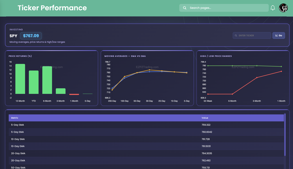
In this capture the Price Returns chart shows green bars for 12-Month, YTD, 6-Month and 3-Month, with the 12-Month and 6-Month bars the tallest at roughly 14 to 15. The 1-Month bar is a small red sliver and the 5-Day bar sits at about zero. That reads as a strong year that has flattened out over the last month. The table backs up the flat read. The price of $767.09 sits above the 5-Day SMA (759.322), the 10-Day SMA (761.728), the 20-Day SMA (764.3035) and the 50-Day SMA (759.731), but by less than $8 in each case. On the Moving Averages chart the orange SMA line and the blue EMA line start around 716 to 720 at the 200-Day end, climb steeply through the 100-Day and 50-Day points, and then level off in the low 760s. The two lines cross near the 10-Day point, and the table shows why. At 5-Day the EMA (760.6042) is above the SMA (759.322), at 10-Day they are nearly equal (761.728 SMA, 761.5031 EMA), and at 20-Day the SMA (764.3035) is above the EMA (762.492). On the High / Low chart the green High line stays close to 780 across every window, while the red Low line rises from about 630 at 52-Week and 6-Month to about 750 at 1-Month. The stock is trading near the top of that range.
How Ticker Performance differs from the rest of investing
Ticker Performance is about price behavior only. It does not look at the business. Basic Financials covers valuation, profitability and growth, and Company Profile lists identifying facts such as exchange and industry. Sector Metrics compares metrics across a whole sector. Historical Market Cap charts a company's total value across a date range you choose. Dividends lists each cash payment with its dates, income that a price chart does not show. Earnings Surprises compares reported earnings with what analysts expected. Recommendation Trends, Upgrade and Downgrade and Price Target summarize what analysts think, Social Sentiment shows how the retail crowd is talking about the stock, and Support and Resistance marks price levels where a stock has stalled before. Congressional Trading lists stock trades that members of Congress have disclosed, which you can line up against the price history here. For the headlines behind a move, Market News lists general financial stories across the whole market. Company News lists recent headlines for the ticker you are checking. Financial Statements shows the reported revenue, profit, debt and cash behind the price, by year or quarter. Analyst Estimates shows what analysts expect that revenue and profit to be next, with a high and a low forecast.
Other categories answer nearby questions. Technical Analysis rates one symbol from Strong Sell to Strong Buy with oscillator and moving average gauges, while this page shows the raw moving average values. Top-50 Aggregate Technicals lays moving averages across the fifty largest stocks. Retail Trend Navigator and Market Trend Signals turn moving averages into trend reads, and Stocks Outperforming ranks performance windows against SPY. For a full one-ticker dashboard, Ticker Explorer is the next stop.
Reading the three charts
Every chart carries a faint EZPZTrading.com watermark, has no legend, and shows a value when you hover a point. The colors below come from the chart itself.
| Chart | What you are looking at |
|---|---|
| Price Returns (%) | Six bars, left to right: 12-Month, YTD, 6-Month, 3-Month, 1-Month and 5-Day. A bar is green at zero or above and red below zero. YTD is the return since the start of the calendar year. |
| Moving Averages | Two lines, the orange SMA and the blue EMA, plotted across seven lookback windows from left to right: 200-Day, 100-Day, 50-Day, 30-Day, 20-Day, 10-Day and 5-Day. The bottom axis is the window length, not time. |
| High / Low Price Ranges | Two lines, the green High and the red Low, across four windows from left to right: 52-Week, 6-Month, 3-Month and 1-Month. |
The Metric and Value table
The table sits under the charts in a scrolling panel with a fixed Metric and Value header. It has 28 rows in this order. Values print as they arrive, with no dollar signs and no rounding to two decimals, so you may see 760.6042 next to 759.322.
| Rows | What you are looking at |
|---|---|
| 5-Day 10-Day 20-Day 50-Day 100-Day 200-Day | An SMA row and an EMA row for each window, twelve rows in all. Compare each one with the price in the header. |
| 1-Month 3-Month 6-Month 52-Week | A High row and a Low row for each window, eight rows in all. |
| 14-Day RSI | A momentum reading between 0 and 100. Traders often frame 70 or above as stretched to the upside and 30 or below as stretched to the downside. Those are common conventions, not signals. |
| Beta | How much the stock has tended to swing compared with the broad market. Above 1 means larger swings than the market, and below 1 means smaller. |
| YTD Return (%) 1-Month Price Return (%) 3-Month Price Return (%) 6-Month Price Return (%) 12-Month Price Return (%) | The same returns the bar chart draws, as numbers. The 3, 6 and 12 month rows print with a % sign and the YTD and 1-Month rows print without one, so read the row label, not the sign. |
| 10-Day Avg Vol | Average daily share volume over ten days, printed in millions with two decimals and an M. A thinly traded stock can read 0.00M. |
Working the page
- Search a ticker: type a symbol, then press Enter or click Go. The page uppercases what you type. With nothing typed, the page loads SPY.
- Header price: the blue badge is the current price. The averages, highs, lows and returns come from a separate data request, so compare them with the badge but do not expect them to update at the same instant.
- When it says no data: if a symbol returns nothing, the content area shows "No data found." in red.
- No refresh: the page loads once and after each search. It does not update while you sit on it.
- Hover for values: point at any bar or line marker on a chart to read its number.
How people actually use it
Trend check before a deeper look
See whether the price sits above the 50-Day and 200-Day averages and whether the Moving Averages line rises toward the right. A stock under both may be fighting a larger downtrend.
How extended is it
Compare the header price with the 52-Week High and Low in the table. Sitting close to one edge tells you how much room is left in the other direction.
Short versus long agreement
Line up the 5-Day and 1-Month bars against the 6-Month and 12-Month bars. A green year with a red month is a stock that is cooling, and the reverse is a stock that is starting to turn up.
SMA versus EMA gap
When the EMA is above the SMA at a window, recent prices are weighing more. When the SMA is above the EMA, recent prices have slipped. As in the capture, the gap can flip sign from the 5-Day to the 20-Day.