Learn Center
Historical Market Cap
One line that shows how a company's total market value has changed across any date range you choose.
What is historical market cap and how do you read the chart?
Historical market cap is a company's total stock market value, share price times shares outstanding, tracked across a range of dates. The EZPZ Historical Market Cap page draws it as a single line for one ticker, so you can see how the market's valuation of the whole company rose or fell over the dates you pick, not just the price of one share.
Read the line by its shape and its size in percent, not by the axis numbers. A rising line means the company's total value grew over that stretch. A falling line means it shrank. Because market cap moves with the share price and with the number of shares, the line usually tracks the stock price closely, and the two only pull apart when the share count changes, for example after a large buyback or a new share offering. The page shows one line and no price line, so it cannot tell you which of the two moved. It also cannot say whether a company is cheap or expensive. It shows size over time. Pair it with a price chart when you want to know why the value changed, and always convert a move into a percentage before you compare it with another company.
How the Historical Market Cap page works on EZPZ
The page opens on AAPL with a default range that runs from 15 days ago to today. The header card shows the word Investing above a title that starts as Historical Market Cap and adds the ticker once the data loads. On the right sit four controls.
| Control | What it does |
|---|---|
| Start Date | Opens a date picker in YYYY-MM-DD form. You cannot pick a date in the future. |
| End Date | The last day of the range. It also stops at today. |
| Ticker | Type a symbol. The box uppercases what you type. Leave it blank and the page uses AAPL. |
| Search | Loads the chart for the ticker and dates currently in the boxes. Pressing Enter in the Ticker box does the same. |
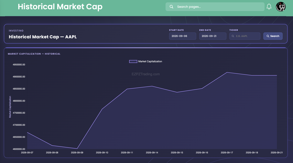
Below the header the page has just one block, the Market Capitalization Historical chart. There is no table of values, so the chart is the whole page.
The Market Capitalization chart
The chart is a single purple line with a lighter fill under it. The legend above it reads Market Capitalization, and the vertical axis carries the same title.
- One label per data point. The horizontal axis prints one date under each point, oldest on the left and newest on the right. The spacing is even by label, not by calendar. In the capture the line goes from 2026-09-11 straight to 2026-09-14, so the weekend gets no slot.
- The vertical axis fits itself to the data. It does not start at zero. In the capture it runs from 4,600,000 to 4,950,000, so a move of about 7 percent fills the whole chart height and looks bigger than it is.
- Ticks print with two decimals and no separators. A tick reads 4900000.00, not 4.9M. The page states no unit.
- Hover for exact numbers. The line has no dots. Move the cursor across the chart and a tooltip shows the date and the exact value at that point.
- The legend is a toggle. Clicking Market Capitalization hides the only line and leaves an empty chart. Click it again to bring the line back.
The page never says what unit the numbers are in. For AAPL a reading near 4,900,000 fits millions of dollars, about $4.9 trillion, which is the size you expect from the world's largest listed companies. Treat that as a reading of the size, not a printed fact, and check the Market Cap row on Company Profile if you want the number in words.
Reading the AAPL example
The capture covers eleven points, 2026-09-07 through 2026-09-21. The Start Date was Sunday 2026-09-06, so the first point is the next day. The values below are read off the chart, so treat them as approximate and hover for exact figures.
- Down first. The line starts near 4,670,000, slides to about 4,615,000 on 2026-09-08, and bottoms near 4,600,000 on 2026-09-09.
- The sharp turn. From 2026-09-09 to 2026-09-10 it jumps to about 4,765,000, a gain of roughly 3.5 percent in one step. By 2026-09-11 it is near 4,850,000.
- A flat middle. From 2026-09-11 to 2026-09-16 it stays between about 4,835,000 and 4,860,000, with a small dip on 2026-09-15.
- The high. It peaks near 4,920,000 on 2026-09-17, then eases to about 4,905,000 on 2026-09-18 and holds nearly level into 2026-09-21.
From the low on 2026-09-09 to the high on 2026-09-17, the company's value rose roughly 7 percent, or about 320,000 on the axis scale. Across the whole capture the line ends about 5 percent above where it started. That is a big enough move to fill the chart, yet small for a single stock over two weeks, which is why the percentage matters more than the shape.
How Historical Market Cap differs from nearby Investing pages
This page answers "how big has this company been, and how has that changed?" It is the one page in this category that draws a company's size as a line over dates you choose. Company Profile lists the current Market Cap, Shares Outstanding and Float Share as single numbers, which is the snapshot this chart puts in motion. Ticker Performance shows what the share price did, with returns, moving averages and 52 week ranges, so it is the natural partner when you want to separate a price move from a share count change. Basic Financials and Financial Statements show the business behind the value, and Sector Metrics compares ratios against a whole sector. Dividends covers what a company pays out, Earnings Surprises compares reported EPS with what analysts expected, and Analyst Estimates shows the forward numbers. Recommendation Trends, Upgrade and Downgrade and Price Target show what analysts think. Social Sentiment shows the retail mood, and Support and Resistance marks price levels where a stock has stalled before. Congressional Trading lists stock trades that members of Congress have disclosed, and Company News and Market News list the headlines that often sit behind a big step on the chart.
Outside this category, Ticker Explorer is the one-symbol dashboard when you want price, options and unusual activity beside the size you just charted.
What to check before you rely on it
- Percent, not points. Divide the change by the starting value. A move that looks huge on a tight axis can be a few percent.
- The date range. The default is only 15 days. Set both dates, then click Search or press Enter.
- One ticker at a time. There is no way to overlay two companies. Load each one, note the percent change over the same dates, and compare the numbers.
- The unit. The page does not print one. Sanity check the level against a size you know, such as the Market Cap on Company Profile.
- Price versus share count. If the line and the stock price tell different stories, a change in shares outstanding is the usual reason. This page cannot show which.
- Empty results. A symbol with no data in your range should leave the chart empty. Check that the title shows the ticker you typed, then try a wider range.
Who uses historical market cap
Long-term investors
Widen the range to see how a company's value grew or shrank across different market phases.
Peer comparers
Load two companies over the same dates and compare percent changes, since size is a fairer yardstick than share price.
Event checkers
Look for a sharp step around an earnings date, an offering or a headline, then confirm the cause in the news pages.
Buyback watchers
Set the line beside the stock price to spot stretches where the two disagree, which points to a change in share count.